
Please review my IELTS writing task 1
Topic : The graph below shows the average carbon dioxide (CO2) emissions per person in the United Kingdom, Sweden, Italy and Portugal between 1967 and 2007.
Summarise the information by selecting and reporting the main features, and make comparisons where relevant.
My es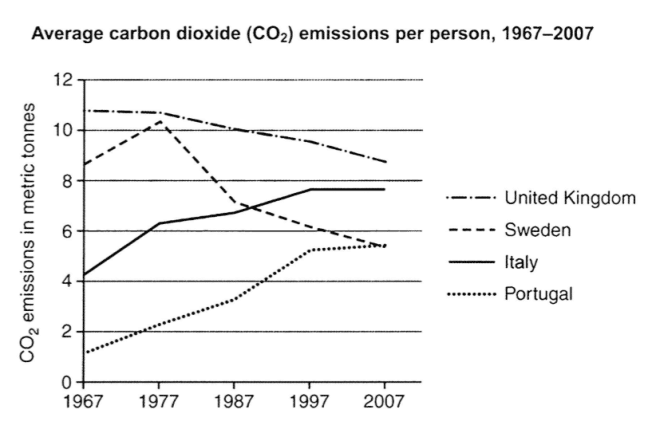
My essay:
A glance at pie chart provided reveals the amounts of CO2 emitted by each person in 4 countries( United Kingdom, Sweden, Italy and Portugal) from 1967 to 2007. Units are measured in mectric tonnes.
Overall, over the period, British emitted the biggest amount of CO2 to the environment while the level of emissions is lowest in Portugal. It is interesting to note that the amounts of CO2 emissions emitted in UK and Sweden decreased while those of Italy and Portugal increased.
Soaring from approximately 8 mectric tonnes in 1967 to over 10 mectric tonnes in 1977, the rate of CO2 emissions in Britain then plummeted to somewhere in the vicinity of 5 mectric tonnes in 2007. The Sweden’s emission, meanwhile, saw a slight decline over the period, from above 11 mectric tonnes in 1967 to less than 9 mectric tonnes in 2007.
On the other hand, starting at the low of just 1 mectric tonnes in 1967, the amount of CO2 emission per persion in Portugal grew rapidly to nearly 6 mectric tonnes in 1997. The next decade brougt a small growth in this figure. A similar trend was seen in Portugal, where the level of CO2 emitted by each people rose significantly from above 4 in 1967 to under 8 mectric tonnes in 1997, before remaining unchanged in the end of the period.
Top answer
) countrie s( United Kingdom, Sweden, Italy and Portugal) from 1967 to 2007. Units are measured in mectric tonnes. Overall, over the period, the British emitted the biggest highest amount of CO 2 to the environment while the level of emissions is lowest in Portugal.
- ) countrie s( United Kingdom, Sweden, Italy and Portugal) from 1967 to 2007.
- Units are measured in mectric tonnes.
- Overall, over the period, the British emitted the biggest highest amount of CO 2 to the environment while the level of emissions is lowest in Portugal.
- It is interesting to note that (Those words are unnecessary.
- ) the amounts of CO 2 emissions emitted in UK and Sweden decreased while those of Italy and Portugal increased.
Get the Weekly English Kit 📬
New words, one handy idiom, and a 2-minute quiz — delivered to your inbox to keep your streak alive.
A glance at (Do not begin a formal essay with glancing at something.) pie chart (Do you know the difference between a bar chart, pie chart and line graph?) provided reveals (Not a good word choice for a math/science
 Related Questions