
Please Review My IELTS task 1 Writing (two bar charts)
The charts below show the proportions of the world’s oil resources held in different areas, together with the proportions consumed annually in the same areas.
Summarise the information by selecting and reporting the main features, and make comparisons where relevant.
Write at least 150 words.
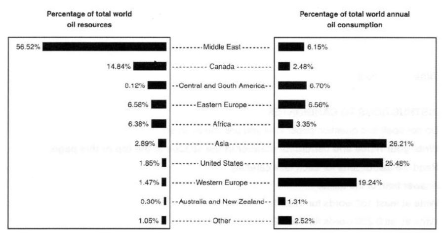
The first bar chart shows the percentage of whole oil resources throughout the world for different regions like the Middle East, Canada, The US, Asia, Eastern and Western Europe, and Australia and New Zealand. The second one shows the proportion of total oil consumed in a year for the same regions of the world.
The Middle East has biggest oil resources with more than half of them. Canada and central and south America rank second and third with about 15% and 8% respectively. Australia and New Zealand have lowest amount of oil resources with just 0.30%.
Although Asia is not one of the biggest oil producers in the world (the 6th place with 2.89%), it is the biggest oil consumer with a proportion of 26.21%. After that, The United States has approximately a quarter of oil consumption in the world. About one-fifth of oil consumption in the world occurs in western Europe. Australia and New Zealand are the least consumers of oil in the world with just 1.31%.
Overall, oil production and consumption in the world regions have different patterns.
Top answer
The first bar chart shows the percentage of whole world's oil resources located in nine different regions: throughout the world for different regions like the Middle East, Canada, Africa, t he US, Asia, Eastern and Western Europe, and Australia and New Zealand. The bars are in rank order, with the highest resource regions first. The second one shows the proportion of total oil consumed in a year for the se same regions of the world.
- The first bar chart shows the percentage of whole world's oil resources located in nine different regions: throughout the world for different regions like the Middle East, Canada, Africa, t he US, Asia, Eastern and Western Europe, and Australia and New Zealand.
- The bars are in rank order, with the highest resource regions first.
- The second one shows the proportion of total oil consumed in a year for the se same regions of the world.
- The bars are in the same order as the first chart.
- ) oil resources with more than half of them .
Get the Weekly English Kit 📬
New words, one handy idiom, and a 2-minute quiz — delivered to your inbox to keep your streak alive.
The first bar chart shows the percentage of whole world's oil resources located in nine different regions: throughout the world for different regions like the Middle East, Canada, Africa, the US, Asia, Eastern and Western Europe, and
 Related Questions