
Please review my IELTS task 1 writing, thank you
The prompt:
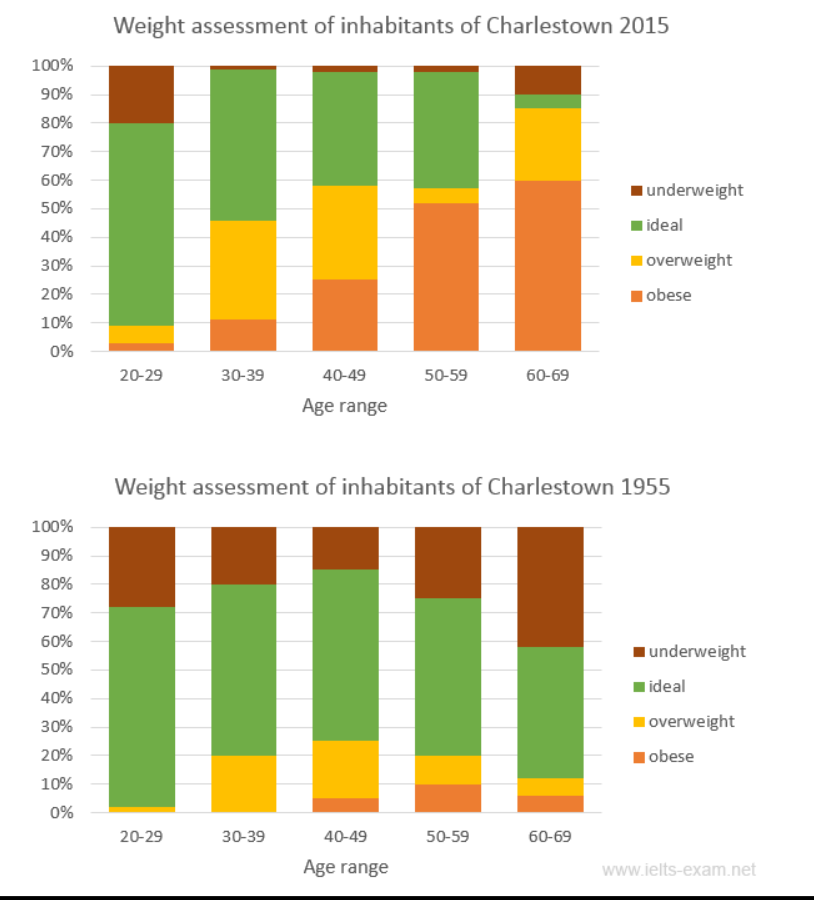
The charts summarise the weight measurements of people living in Charlestown in 1955 and 2015.
Summarise the information by selecting and reporting the main features, and make comparisons where relevant.
My essay:
The stacked bar charts show the percentage of underweight, ideal, overweight, and obese amongst each age range, from age 20 to age 69, of Charlestown citizens. One chart shows data gathered in 2015 while the other shows data in 1955.
Overall, in 2015, there were generally fewer people within the ideal measurement in each age group and more obese as people grew older. In contrast to 1955, where the people in the ideal category were the majority in every age range.
In 2015, there were already obesity within the age 20 to 29 range, although it was less than 5% in this group. The majority, up until age 49, were the ideal type, ranging from 70% to 40% of each group. From there on, the obese category took up the large proportion, accounted for around 50% of the 50-59 age group, and approximately 60% of the 60-69 group.
In 1955 however, most of the population at the time either belonged to the ideal type or the underweight type. The main category of any group were the people of the ideal weight assessment, ranging from little over 70%, to nearly half of the group. People of the obesity type were less than 10% and only showed up on the data since the age of 40 and higher.
Get the Weekly English Kit 📬
New words, one handy idiom, and a 2-minute quiz — delivered to your inbox to keep your streak alive.
 Related Questions