
Please review my IELTS task 1 writing
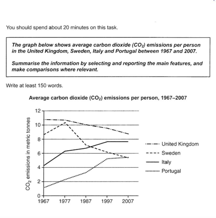
The graph illustrates the average carbon dioxide emissions per person (PP) in 10 years from 1967 to 2007 in the United Kingdom, Sweden, Italy, and Portugal.
It is clear that while Portugal and Italy showed an increasing pattern of CO2 released PP, the United Kingdom and Sweden had a decreasing rate.
In 1997 The United Kingdom residents produced about 11 tonnes while other countries had relatively smaller numbers. From 1996 to 1997 Sweden, Italy and Portugal had a rising rate. On the contrary Sweden had a major decrease between 1997 and 1998 from about 10 to 6 tonnes of CO2 emission, this reducing trend continued until 2007 with about 5 toonnes which was equal to CO2 emission PP in Italy in that same year.
On the other hand, the emission rate for Sweden and Italy stated with approximately 1 and 4 tonnes respectively and grew each year until 2007 and reached around 6 and 8 tonnes.
Top answer
) graph illustrates (very poor verb choice. ) the average carbon dioxide emissions per person (PP) in 10 years from 1967 to 2007 in the United Kingdom, Sweden, Italy, and Portugal. It is clear that (Not a useful clause.
- ) graph illustrates (very poor verb choice.
- ) the average carbon dioxide emissions per person (PP) in 10 years from 1967 to 2007 in the United Kingdom, Sweden, Italy, and Portugal.
- It is clear that (Not a useful clause.
- Read my advice) while Portugal and Italy showed an increasing pattern of CO2 released PP, the United Kingdom and Sweden had a decreasing rate .
- (wrong word.
Get the Weekly English Kit 📬
New words, one handy idiom, and a 2-minute quiz — delivered to your inbox to keep your streak alive.
The (What kind of graph?) graph illustrates (very poor verb choice. ) the average carbon dioxide emissions per person (PP) in 10 years from 1967 to 2007 in the United Kingdom, Sweden, Italy, and Portugal.
It is clear that (Not a useful clause. Read my advice) while Portugal and Italy showed an incr
 Related Questions