
Please review my IELTS task 1 essay. Thank you!
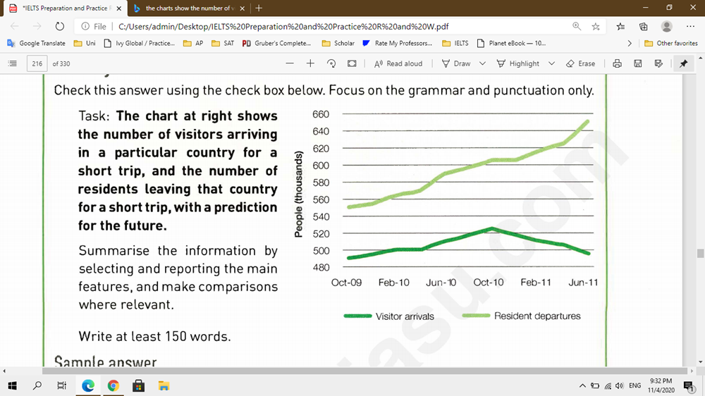
The chart at right shows the number of visitors arriving in a particular country for a short trip, and the number of residents leaving that country for a short trip from 2009 to 2011.
-------------------------------------------------------------------
My essay:
The line graph compares the number of people visiting a particular country with that leaving that country in a short period of time, measured in thousand people.
Overall, visitors arrived in that country more than the resident departures throughout the years. Furthermore, while the number of travelers increased significantly in two years, that of the citizens of the country remained the same.
In October 2009, there were around 550 thousand people traveling to this country, which was nearly 60 thousand more individuals than those leaving. Moreover, from 2009 to 2010, the figure for visitors rose gradually to reach its peak at approximate 650 thousand in June 2011.
On the other hand, the resident departures in October 2009 were 490, which went up to around 530 thousand one year later after staying unchanged in 4 months (from February 2010 to June 2010). It later decreased rapidly to have the same number as in October 2009.
Top answer
This Task 1 has some problems. The instructions say " with a prediction for the future " but it does not give any indication of the present time for that graph. It cannot be 2020, because the entire date range on the graph is in the past (2009-2011).
- This Task 1 has some problems.
- The instructions say " with a prediction for the future " but it does not give any indication of the present time for that graph.
- It cannot be 2020, because the entire date range on the graph is in the past (2009-2011).
- Without this distinction, the graph becomes simplistic and trivial.
- And all the information in a trivial graph can be described in 100 words.
Get the Weekly English Kit 📬
New words, one handy idiom, and a 2-minute quiz — delivered to your inbox to keep your streak alive.
This Task 1 has some problems. The instructions say "with a prediction for the future" but it does not give any indication of the present time for that graph. It cannot be 2020, because the entire date range on the graph is in the past (2009-2011). Without this distinction, the graph becomes simplistic and trivial. And all the information in a trivial graph can be described in 100 words
 Related Questions