
Please review my IELTS task 1 essay. Thank you!
The pie charts below show the average household expenditures in a county in 1950 and 2010.
------------------------------------------------------------------------------------
My essay:
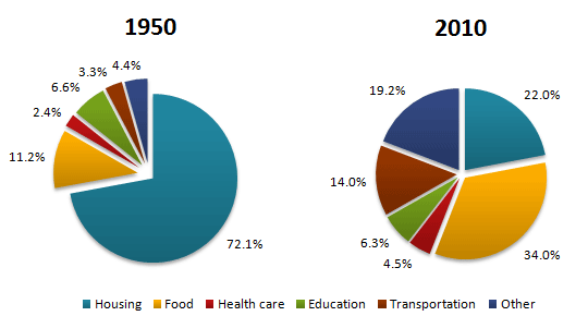
The pie charts compare the percentage of expenditures which were used for six household categories: housing, food, healthcare, education, transportations, and others between 1950 and 2010.
Overall, while housing had the largest share in 1950, in 2010, the largest proportion belonged to the food category. Furthermore, except for housing and education, there was an increase in the average spending on the rest of the group.
In 1950, nearly three-quarters of the money was spent on housing, at 72.1%, which was followed by food (11.2%), education (6.6%), others (4.4%), transportations (3.3%), and finally healthcare (2.4%) respectively.
On the other hand, in 2010, the percentage of salary used for food surpassed that for housing to rank first, which was measured at 34% compared to 22%. Moreover, the money for other categories and transportations was three times higher than it was in 1950. Education ranked fourth after declining back to 6.3%, and healthcare still shared the least quantity despite being doubled to 4.5% after 60 years.
Top answer
It is a very good effort. However, you have some usage errors and spelling mistakes. The pie charts compare the percentages of household expenditures which were used for five named household categories: housing, food, healthcare, education, transportations , and others ("Others" is not a specific category.
- It is a very good effort.
- However, you have some usage errors and spelling mistakes.
- The pie charts compare the percentages of household expenditures which were used for five named household categories: housing, food, healthcare, education, transportations , and others ("Others" is not a specific category.
- ) between 1950 and 2010.
- Overall, while housing had the largest share in 1950, in 2010, the largest it had changed (Use the pronoun "that" or "it" to refer to "the largest share".
Get the Weekly English Kit 📬
New words, one handy idiom, and a 2-minute quiz — delivered to your inbox to keep your streak alive.
It is a very good effort. However, you have some usage errors and spelling mistakes.
The pie charts compare the percentages of household expenditures which were used for five named household categories: housing, food, healthcare, education, t
 Related Questions