
Please review my IELTS task 1 essay. Thank you!
Task 1: The bar chart below shows the numbers of men and women attending various evening courses at an adult education center in the year 2009. The pie chart gives information about the ages of these course participants.
-----------------------------------------------------------------------------------------------------------
My essay:
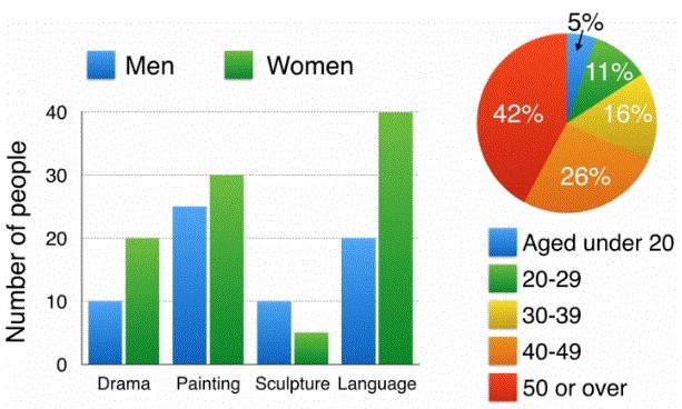
The table compares the number of each gender who joined in four courses: drama, painting, sculpture, and language. While the pie chart shows the percentage of course participants in five age groups from smallest to largest: under 20 (teenagers), 20-29 (young people), 30-39 (adults), 40-49 (mid-aged), and over 50 (elderly).
Overall, in the first graph, there were more women than men who participated in evening courses, except for the sculpture class. Furthermore, the gap between two genders in language class was the largest. In the second graph, nearly half of the people taking part in these courses were senior citizens.
The sculpture course was the only one which had the number of men over women, at 10 people compared to 5. Furthermore, men joined in painting class more than other classes, stood at around 25 people, whereas language course had the highest number of women, registered at 40.
42% of people in evening courses were the elderly, which were 16% more than the second-largest figure, the mid-aged group, at 26%. In particular, teenagers had the smallest share among other groups, holding at 5%.
Please check my grammar errors, thank you!!!
Top answer
) compares the number of each gender men and women who joined in four kinds of evening courses (drama, painting, sculpture, and language) at a particular institution in 2009. While the pie chart shows the percentage of course participants in five age groups from smallest to largest: under 20 (teenagers), 20-29 (young people), 30-39 (adults), 40-49 (mid dle -aged), and over 50 ( older adults elderly ). Overall, in the first graph, Your introduction described a chart and a table.
- ) compares the number of each gender men and women who joined in four kinds of evening courses (drama, painting, sculpture, and language) at a particular institution in 2009.
- While the pie chart shows the percentage of course participants in five age groups from smallest to largest: under 20 (teenagers), 20-29 (young people), 30-39 (adults), 40-49 (mid dle -aged), and over 50 ( older adults elderly ).
- Overall, in the first graph, Your introduction described a chart and a table.
- Now you claim there is a graph.
- Really?
Get the Weekly English Kit 📬
New words, one handy idiom, and a 2-minute quiz — delivered to your inbox to keep your streak alive.
The table (Sorry, I cannot see a table.) compares the number of each gender men and women who joined in four kinds of evening courses (drama, painting, sculpture, and language) at a particular institution in 2009
The table bar chart [ 1] compares the numbers of each gender males and females who joined participated in four courses: drama, painting, sculpture, and language
 Related Questions