
Please review my IELTS task 1 essay. Thank you!
Task 1: The line graph shows the percentage of New Zealand population from 1950 to 2050. Summarize the information by selecting and reporting the main features and make comparisons where relevant.
----------------------------------------------------------------------------------------------
My essay:
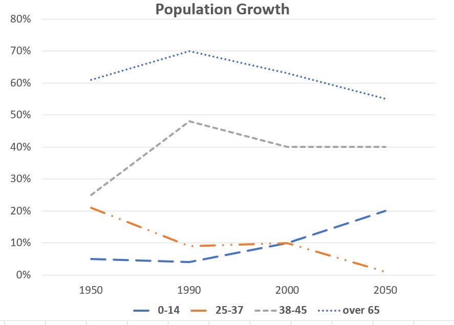
The line chart compares the New Zealand population growth of 4 age groups: 0-14 (children), 25-37 (adults), 38-45 (mid-aged) and over 65 (retired) in 100 years, from 1950 to 2050, measured in percentage.
Overall, while there was a decrease in the quantity of people aged over 65 and from 38 to 45, two age groups saw an opposite trend. In particular, the population growth of elderly was always higher than other population groups.
The percentage of people aged 65 and older reached it peak at 70% before declining dramatically to roughly 55% in 2050. In the same pattern, the adults group in 2050 was 20% less than it used to be in 1950, at around 1% compared to 20% respectively, despite remaining at 10% from 1990 to 2000.
On the other hand, the population growth of the age group of 38-45 rose steadily to approzimate 48% in 1990, later went down and remained the same at 40% from 2000 to 2050. Moreover, although the percentage of children population was constant at around 5% in the first 40 recorded years, it went up significantly to surpass the adults population in 2000 before standing at 20% in 2050.
Thank you!!
Top answer
n 8023 The line chart There is no such thing as a line chart. Please learn the correct names of these figures. n 8023 quantity of people We do not use "quantity" for people.
- n 8023 The line chart There is no such thing as a line chart.
- Please learn the correct names of these figures.
- n 8023 quantity of people We do not use "quantity" for people.
- It is only for things.
- n 8023 Task 1: The line graph shows the percentage of New Zealand population This graph is mathematically flawed.
Get the Weekly English Kit 📬
New words, one handy idiom, and a 2-minute quiz — delivered to your inbox to keep your streak alive.
Hà Tr?n 8023The line chart
There is no such thing as a line chart.
Please learn the correct names of these figures.
Hà Tr?n 8023quantity of people
We do not use "quantity" for people.
It is only for things.
Hà Tr?n 8023Task 1: The line graph shows the percentage of New Zeala
 Related Questions