
Please Review My IELTS Task 1 Essay
Topic: The graphs give information about average house prices in England. Summarize the information by selecting and reporting the main features, and make comparisons where relevant.
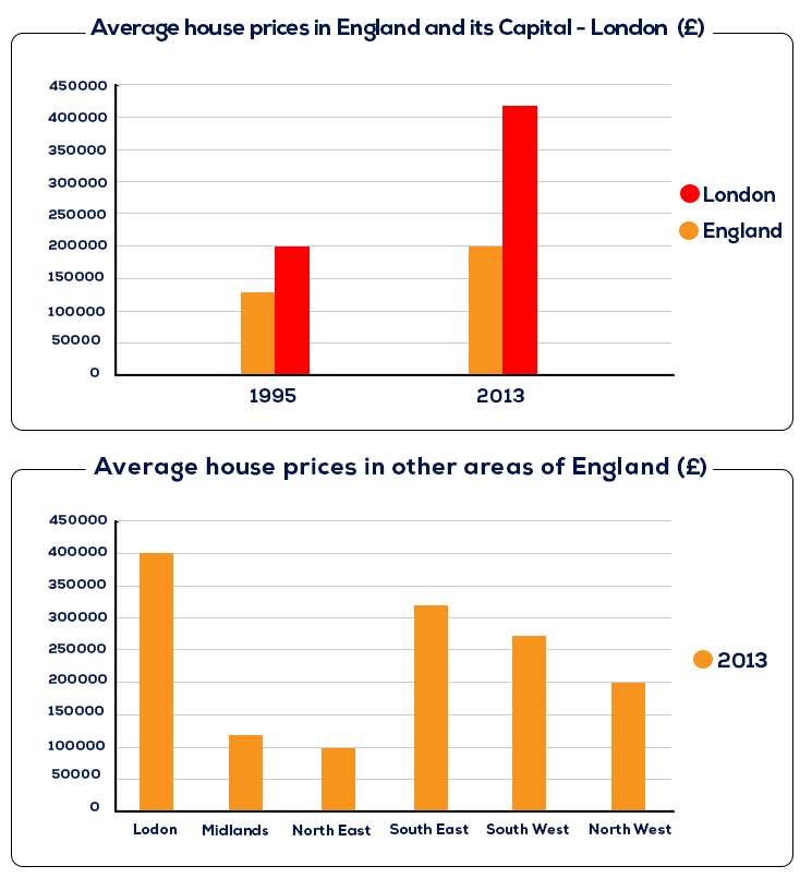
The first graph gives information about the house prices in 1995 and 2013 in England and its Capital - London, the second chart compares the cost to buy houses in 6 areas of England.
Overall, from 1995 to 2013, the increase of house prices in London was higher in England. People had to pay more to buy a house in London than other regions in England in 2013.
The house prices in London in 2013 were more than double that in 1995, more than 400000 and 200000 respectively. In England, there was a marginal climb from 130000 in 1995 to 200000 in 2013.
To be more specific in 2013, London’s house prices is much higher than other regions, which was 4 times as much as that in the lowest house prices areas – The North West. After London, the South East and South West also had higher prices than the average of England, about 310000 and 270000 in order. The average prices in North West were 200000, which was nearly double in the Midlands (more than 100000).
Top answer
The first graph (Use the correct names for the graphics. Read my advice. ) gives information about (That is very vague and unspecific.
- The first graph (Use the correct names for the graphics.
- Read my advice.
- ) gives information about (That is very vague and unspecific.
- Information could be almost anything.
- ) the house prices in 1995 and 2013 in England and its C apital (Capital is not a proper noun.
Get the Weekly English Kit 📬
New words, one handy idiom, and a 2-minute quiz — delivered to your inbox to keep your streak alive.
The first graph (Use the correct names for the graphics. Read my advice. ) gives information about (That is very vague and unspecific. Information could be almost anything. Instead tell the reader what is plotted.) the house prices in 1995 and 2013 in England and its
 Related Questions