
Please Review My IELTS Task 1 Essay
Topic:
The charts below show the ercentage of people living in Australia, born in Asia, UK and other regions.
Summarize the information by selecting and reporting the main features, and make comparisons where relevant.
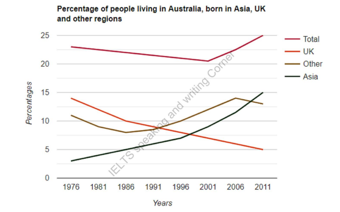
The line graph gives information about the changes in the proportion of Australian population who were born in the UK, Asia and other regions from 1976 to 2011.
Overall, in the first 15 years (from 1976 to 1991), the percentage of people who were born in the UK was the highest, while towards the end of the period, there are more those from Asia and other regions than from the UK.
In total, the percentage declined gradually from about 23% in 1976 to more than 20% in 2001. This figure went up sharply by nearly 5% over 10 years, reaching a peak of 25% in 2011. In terms of people from the UK, there was a considerably decline over 35 years, with the proportion going down from about 14% in 1976 to 5% in 2011.
Australia saw the percentage of people coming from Asia rise remarkably, climbing from 3% in 1976 to the peak of 15% in 2011. In 1976, the figure of people born in Asia was the lowest, whereas it comprised the highest proportion in 2011. In terms of people from other regions, the percentage decreased from 1976 to 1986, a drop of about 5%. Australia witnessed a sharp growth between 1986 and 2006, reaching a peak of 14% in 2006. In the last 5 years of the period, there was a drop of nearly 2% to more than 12% in 2011.
Top answer
Please read my advice for Task 1 essays: IELTS TASK 1: Hints, Tips And Advice Vocabulary Words For Task 1: Reference Post
- Please read my advice for Task 1 essays: IELTS TASK 1: Hints, Tips And Advice Vocabulary Words For Task 1: Reference Post
Get the Weekly English Kit 📬
New words, one handy idiom, and a 2-minute quiz — delivered to your inbox to keep your streak alive.
Please read my advice for Task 1 essays:
The line graph gives information about the changes in (Incorrect. "Give information" is vague and nonspecific. What is plotted?) the proportion of Australian population who were born in the UK, Asia and other regions from 1976 to 2011.
Overall, in during the first 15 years (from 1976 to 1991), the percentage of peopl
Sample essay
The line graph shows the percentage of the Australian population who were not native born, during the period 1976-2011. The total is broken down into three sub-groups, those from the UK, Asia, and the rest of the world.
Overall, in 1976 there were more British-born people compared to Asians and the others. However, their proportion declined steadily, and by 2011, they
 Related Questions