
Please review my IELTS task 1
Topic: The graph below gives information about how people in the United Kingdom spend their income. Summarize the information by selecting and reporting the main features and make comparison where relevant.
My essay:
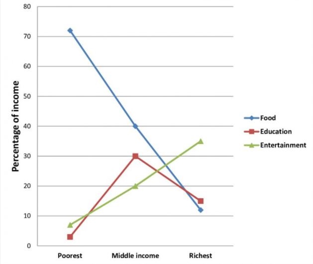
The line graph displays the percentage of income that residents in the UK spend in food, education and entertainment.
Overall, the spending habits differ widely according to the level of income earned. While the poorest and middle class are seen spending the most on food, the richest consumes most of their income on entertainment.
As per the chart, the poorest spend three-forth of income on purchasing food, much higher than other two groups. Meanwhile, the share of money they use for education and entertainment is much lower, ranges from 0-30%.
When it comes to the middle class, the demand for spending money on education increase while the income for other purposes slightly decrease. This group is seen spending 30% on education, just 10 less than on food and 10 more than on entertainment.
As the income earned rise, the spending pattern also exhibits changes, with the downward trend on food and education, except entertainment. When they spend over 30% for the latter one, spending on two former range between 12 and 15%.
Thank you so much!
Get the Weekly English Kit 📬
New words, one handy idiom, and a 2-minute quiz — delivered to your inbox to keep your streak alive.
 Related Questions