
Please review my IELTS task 1
You should spend about 20 minutes on this task.
The graph below shows US consumers' average annual expenditures on cell phone and residential phone services between 2001 and 2010.
Write a report for a university, lecturer describing the information shown below.
Summarise the information by selecting and reporting the main features and make comparisons where relevant.
You should write at least 150 words.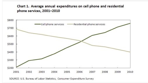
my answer:
The graph represents the average yearly spending by American consumers on mobile phones and landline phones for a decade, from 2001.
As it can be seen, the average spending for mobile phones had an upward trend, while the landline phones gradually decreased. In 2006, both of them reached the same annual expenditure.
In 2002, the average spending of mobile phones by American consumers increased significantly by around 50% compared to 2001 with an annual expenditure of approximately $200. Even though the use of landline phones was approximately over 3 times higher than the mobile phones usage in 2001, the residential phone services gradually fell over the year. In 2003, The increasing rate of spending on mobile phones remained increased.
In 2006, the average yearly spending on mobile phones and landline phones were equal at about $550. However, the mobile phone usage continued to rise in the following year, and reached the peak at almost $800 in 2010. On the other hand, the usage of landline phones was only a half of the average usage of mobile phones in 2010.
Get the Weekly English Kit 📬
New words, one handy idiom, and a 2-minute quiz — delivered to your inbox to keep your streak alive.
 Related Questions