
Please review my IELTS report - mix .
Question -->
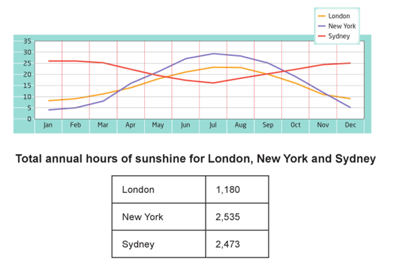
The graph and the table show the average monthly temperatures and the average number of hours of sunshine per year in the three major cities.
My answer-->
The line graph illustrates the mean temperatures per month, whereas the table demonstrates the hours of sunshine on average in a year in London, New York, and Sydney.
Overall, it can be seen that, although London and New York become warmer; but the temperatures start to decrease near the end of the year, and the alternative trend is true for Sydney.
Looking at the line graph first it is clear that, in January the climate condition in London is higher than New York with figures slightly under than 10 and around 5 respectively. As the temperatures in both of these cities is continue to rise, although it becomes higher in New York than in London in the middle of the April, this figure go up gradually and reachs at its peaks in July before showing a downward trend until December with a lower temperature in London than in New York.
Turning to Sydney, the febricity starts to decline from February to July, and then rises back at the end of the year with the lowest point just under 15. From the table, it is observed that New York has the highest number of hours exposed to sunshine (2535), and that is slightly higher than that of Sydney. However, total hours of sunshine in London is the least and that is 1180 hours.
Top answer
Read my advice for Task 1 essays. IELTS TASK 1: Hints, Tips And Advice Vocabulary Words For Task 1: Reference Post
- Read my advice for Task 1 essays.
- IELTS TASK 1: Hints, Tips And Advice Vocabulary Words For Task 1: Reference Post
Get the Weekly English Kit 📬
New words, one handy idiom, and a 2-minute quiz — delivered to your inbox to keep your streak alive.
Read my advice for Task 1 essays.
Sample essay:
The line graph plots the average monthly temperatures, in degrees Centigrade, for three cities, London, New York and Sydney. The table lists the total hours of sunshine per year for these same cities.
Overall, the temperature curves for London and New York are positively correlated, although New York has a greater range of extremes. And both are negatively correl
 Related Questions