
Please review my IELTS report - Line Graph.
Line graph -->
The line graph illustrates the proportion of total expenditure in a certain European country between 1996 and 2000.
My -->
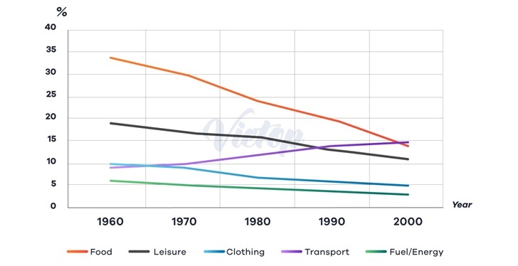
The line graph shows the percentage of a certain European country's expenditure on food, leisure, clothing, transport, and fuel/energy from 1960 to 2000.
Overall, in 1960, the total of these five budget categories amounted to more than three-quarters of the total budget. In 2000, it had fallen to less than half, mainly due to the drop in relative spending on food.
In 1960, about slightly about the third quarter of total spending was used for food, 1.8 times that of leisure, which was the second-highest allocation. However, over the next years relative food expenditure showed rapid decline and ended at around 14% in 2000. In contrast, after a similar but slower rate of decrease, leisure spending rose insignificantly before dropping again in the following years. On the other hand, the percentage allocated on transport had an upward trend, and became the highest among all categories at the end of the period.
As for clothing, it took up a tenth of the total expenditure, nearly as twice as much as for the fuel/energy in 1960. From 1960 to 1970, it was about the same as transport, around 10%, but then it went down and stood at only 5% in 2000. Also in this year, only 2.5% was spend on fuel/ energy, which was approximately half of the value in 1960.
Get the Weekly English Kit 📬
New words, one handy idiom, and a 2-minute quiz — delivered to your inbox to keep your streak alive.
 Related Questions