
Please review my IELTS essay WT1
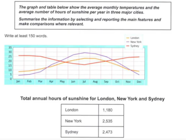
The line graph and the table give information on the average temperature per month and the annual hours of sunshine in London, New York, and Sydney.
Overall, the average temperatures in London and New York followed the similar patterns, although New York was a warmer city at mid-year. Sydney had the warmest climate during this period. The average number of hours of sunshine in London is the lowest.
With regard to the average monthly temperature, in January, New York was the coldest city with an average of under 5 degrees, while Sydney‘s temperature was more than 25 degrees. The temperature of London and New York increased dramatically to 23 degrees and 29 degrees, respectively in July. By contrast, Sydney’s temperature decreased moderately and reached a low point of 16 degrees. In the winter, Sydney was the warmest with an average of 25 degrees, when New York’s temperature was 5 degrees and it was the coldest.
In terms of total hours of sunshine, New York and Sydney had relatively similar averages of 2535 and 2473, respectively. On the other hand, the annual hours of sunshine in London were 1180.
Top answer
The line graph and the table give information on (Vague. Imprecise. You need two sentences.
- The line graph and the table give information on (Vague.
- Imprecise.
- You need two sentences.
- ) the average temperature per month and the annual hours of sunshine in London, New York, and Sydney.
- The line graph plots the average monthly temperatures, in degrees Centigrade, for three cities, London, New York and Sydney.
Get the Weekly English Kit 📬
New words, one handy idiom, and a 2-minute quiz — delivered to your inbox to keep your streak alive.
The line graph and the table give information on (Vague. Imprecise. You need two sentences. One for the graph and one for the table, because they provide completely different information..) the average temperature per month and the annual hours of sunshine in London, New York, and Sydney.
The line graph plots the average month
 Related Questions