
Please review my IELTS essay. Thank you!
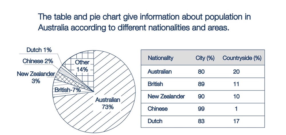
The pie chart compares the percentage of residents in Australia in terms of nationalities. The table indicates the proportion of people from different countries living in the city and countryside of Australia.
Overall, Australians consisted of the largest share, while the smallest figure was the population of Dutch. It is noticeable that the number of people staying in the city is much higher than those choosing the countryside in Australia.
With regard to the pie chart, Australians accounted for three quarters (73%) that ranked first among the nationalities, followed by others with 14%. The population of Dutch, Chinese and New Zealanders made up for similar proportions, ranging from 1% to 3%, leaving the remaining share at 7% for the British.
As can be seen from the table, there is a huge gap between the number of people in the city and the countryside. The figure of Australians and Dutch living in the city is higher by a factor of 4 than those who are in the countryside. UK and New Zealand residents have roughly the same percentages with around 90% living in urban areas. The striking point is the majority of Chinese settling in the city, only 1% prefer life in rural areas.
Top answer
The pie chart compares the percentage of residents in Australia in terms of nationality. nationalities. The table indicates the proportion of people from different countries living in the city and countryside urban and rural areas of Australia.
- The pie chart compares the percentage of residents in Australia in terms of nationality.
- nationalities.
- The table indicates the proportion of people from different countries living in the city and countryside urban and rural areas of Australia.
- Overall, Australians consisted of represent the largest group, share, while the smallest figure was the population of are the Dutch.
- It is also noticeable that the number of people staying in the city urban population is much higher than the rural one, regardless of nationality.
Get the Weekly English Kit 📬
New words, one handy idiom, and a 2-minute quiz — delivered to your inbox to keep your streak alive.
The pie chart compares the percentage of residents in Australia in terms of nationality. nationalities. The table indicates the proportion of people from different countries living in the city and countryside urban and rural areas of Australia.
Overall, Australians con
 Related Questions