
Please review my IELTS essay task1
The line graph compares three capital cities in terms of the number of the international conference they hosted between 1980 and 2010. overall, it can be clearly seen from the graph that unlike cities A and B, city of c experienced an upward trend and also accounted for the host of the highest number of international conferences at end of time frame.
In 1980, the figure for city A was at 35 while that of city B was lower at 30.these numbers similarly fell substantially over the next5 years and hit a low of 30 and 20 respectively. From 1985 onwards, despite some marginal rise, those figures witnessed a steady decline until 2005 when stood at roughly27 for both cities. Although the number of international conferences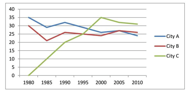
in city B remained quite the same over the subsequent 5 years, that of city A declined to below 25 in 2010.
On the contrary to cities A and B, no international conference was organized in city C in 1980 however, in the next 10 years, 20 such conferences were held in this city. This number rose steadily and peaked at 35 in 2000 as the highest number of the international conference held among 3surveyed cities in the same year after which it fell gradually to just above 30 in 2010.
Top answer
Please include the essay instructions in your post. The line graph compares three capital cities in terms of the number of the international conference (wrong form) they hosted between 1980 and 2010. (You must begin a new paragraph here.
- Please include the essay instructions in your post.
- The line graph compares three capital cities in terms of the number of the international conference (wrong form) they hosted between 1980 and 2010.
- (You must begin a new paragraph here.
- ) overall , (wrong punctuation) it can be clearly seen from the graph that ("Clearly seen" is your opinion.
- ) unlike cities A and B, city of c (wrong phasing) showed experience d (Wrong word.
Get the Weekly English Kit 📬
New words, one handy idiom, and a 2-minute quiz — delivered to your inbox to keep your streak alive.
Please include the essay instructions in your post.
The line graph compares three capital cities in terms of the number of the international conference (wrong form) they hosted between 1980 and 2010. (You must begin a new paragraph here. You have changed focus from the graphic to the information content.
 Related Questions