
Please review my IELTS essay task 1. Thank you ~
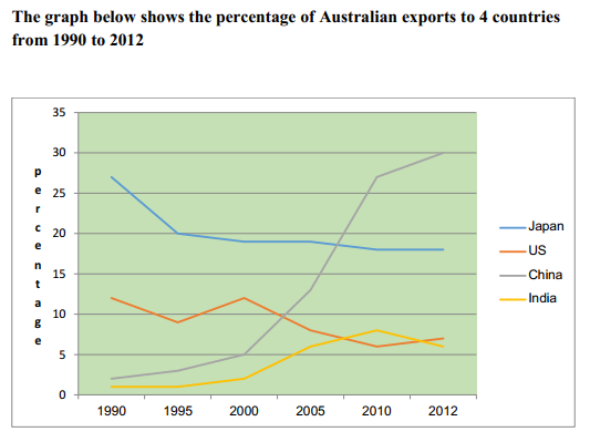
The line graph compares the proportion of products exported from Australian to four countries: Japan, the U.S, China, and India from 1990 to 2012.
Overall, the percentage of Australian exports to China and India went up over the period while the percentage of exports to the other two countries fell after 22 years.
There was a sharp increase in the proportion of products exported to China. From 1990 to 2000, the number doubled from 2.5% to 5% after 10 years. In the next 10 years, the percentage of exports to China increased more than fivefold, finishing at 27%. The number reached 30% in 2012, making China the largest export market among the four countries. India also witnessed an increase in the percentage of Australian imports. The number went up from 1% in 1990 to reach a peak of 8% in 2010 before fell to 6% in 2012.
In contrast, there was a decrease in the percentage of exports to Japan. The number dropped significantly by 7% to reach 20% in the first 5 years and then fell gradually by 2% for the next 17 years. Despite fluctuations, the U.S also saw a decrease in the percentage of Australian imports. The number began at 12% in 1990 and finished at 7% in 2012.
Top answer
S, China, and India from 1990 to 2012. Overall, the percentage of Australian exports to China and India went up over the period while the percentage of exports to the other two countries fell after 22 years . Suggestion: Overall, over the 22-year period, exports rose for two of the countries (China and India) and fell for the other two.
- S, China, and India from 1990 to 2012.
- Overall, the percentage of Australian exports to China and India went up over the period while the percentage of exports to the other two countries fell after 22 years .
- Suggestion: Overall, over the 22-year period, exports rose for two of the countries (China and India) and fell for the other two.
- However, the total share of these four countries went up from under half (about 43%) to well over half (61%) of all exports.
- There was a sharp increase in the proportion of products exported to China.
Get the Weekly English Kit 📬
New words, one handy idiom, and a 2-minute quiz — delivered to your inbox to keep your streak alive.
The line graph compares the proportion of products exported from Australian (wrong word) to four countries: Japan, the U.S, China, and India from 1990 to 2012.
Overall, the percentage of Australian exports to China and India went up over the period while the percentage of exports to the other two countries fell after 22 years
 Related Questions