
Please review my IELTS essay task 1. Thank you!
My essay:
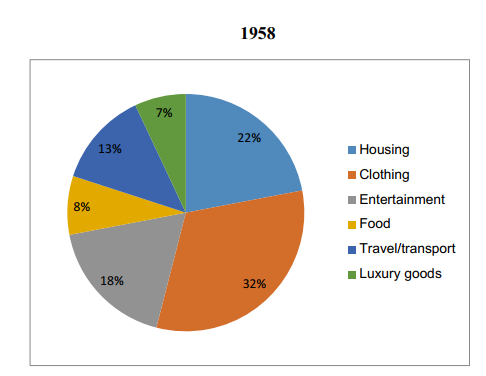
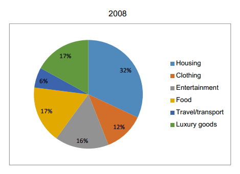
The pie charts compare the percentage of expenditure on six different categories: housing, clothing, entertainment, food, travel/transport, and luxury goods in a European country in 1958 and 2008.
Overall, the proportion of spending on housing, food and luxury goods increased while the other three categories saw a decline in the percentage of spending. ‘Housing’ took over ‘clothing’ and became the largest portion of expenditure in 2008.
‘Housing’ accounted for 22% of total spending in 1958, it went up to 32% after 50 years. The percentage of spending on food and luxury goods also went up significantly, beginning at 8% and 7% respectively in 1958 and finishing at the same figure of 17% in 2008.
In contrast, there was a sharp fall in the percentage of spending on clothes. 'Clothing' category accounted for 32% of total spending in 1958 but after 50 years, it went down by 20%, making it the second last spending category in 2008. While the proportion of travel reduced by half to 6% in 2008, there was a slight decrease in the percentage of spending on entertainment, beginning at 18% and falling to 16%.
Get the Weekly English Kit 📬
New words, one handy idiom, and a 2-minute quiz — delivered to your inbox to keep your streak alive.
 Related Questions