
Please review my IELTS essay (RTI - TEST 5 - TASK 1)
The chart below shows the average household spending pattern for households in three income categories as a proportion of their income.
Summarise the information by selecting and reporting the main features, and make comparisons where relevant.
Write at least 150 words.
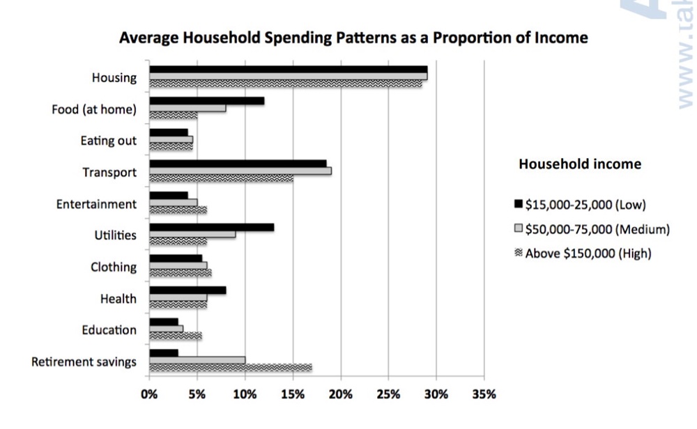
The bar chart gives data about the average household expenses for ten basic demands in three levels of income including low, medium and high. These figures are expressed as a percentage of people’s income.
Overall, resources allocated for housing were the highest whereas eating out took people the least sum of money.
In detail, the expenditures on housing of three income categories were relatively similar, nearly a third. Transport came second with around 18% for the low and the medium and 15% for the high. In contrast, under 5% of household income was spent on eating out by all levels of income.
Moreover, home-cooked food, utilities had the same spending pattern, in which low-income earners spent about more than medium and high-income earners by 5% and 10%, respectively. By contrast, retirement savings recorded a significant proportion of income from the high-paid people (17%) while the others spent by far less money on this demand, 10% and 3% for medium and low-income people. Meanwhile, it took everyone more or less than 5% to services such as entertainment, clothing and education.
(179 words)
* I have been struggled to cover all main features and to group appropriate categories into 2 body paragraphs. Please review this and give me some pieces of advice. Last but not least, I am waiting for your model answer. I really love your writing style. It is simple but attractive. I am about to take part in real IELTS examination soon (next week). Thanks!
Top answer
The bar chart gives data about (That is vague. ) the average household expenses for ten basic demands (wrong word) in three levels of income including (Including means that there are more categories than you listed. ) low, medium and high.
- The bar chart gives data about (That is vague.
- ) the average household expenses for ten basic demands (wrong word) in three levels of income including (Including means that there are more categories than you listed.
- ) low, medium and high.
- These figures (poor word choice.
- Unnatural) are expressed as a percentage of people’s income.
Get the Weekly English Kit 📬
New words, one handy idiom, and a 2-minute quiz — delivered to your inbox to keep your streak alive.
The bar chart gives data about (That is vague. What exactly is plotted?) the average household expenses for ten basic demands (wrong word) in three levels of income including (Including means that there are more categories than
The bar chart gives data about compares three income groups in terms of the average household expenditure expenses for on ten basic categories. demands in three levels of income including low, medi
The bar chart compares the percentages of income that households of three different income levels (low, medium and high) allocate across ten budget categories. These categories include housing, transportation, food (groceries and restaurants) and utilities.
Overall, these categories added up to more than 95% for each income category, so this bar chart represents typical complete budgets
 Related Questions