
Please review my IELTS essay (RTI 3 - Task 1)
The graph below shows the proportion of four different materials that were recycled from 1982 to 2010 in a particular country.
Summarise the information by selecting and reporting the main features, and make comparisons where relevant.
Write at least 150 words.
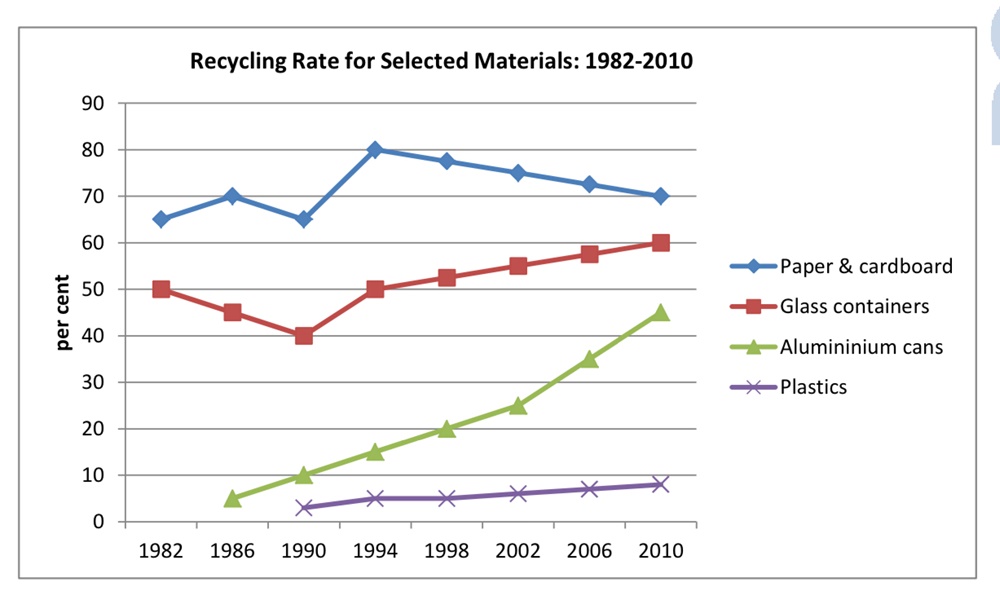
The line graph compares the recycling rate for four categories of paper and cardboard, glass containers, alumininium cans and plastics from 1982 to 2010 in a nation.
Overall, there was an upward trend in the percentage of all four materials recycled over the period. In addition, alumininium cans and plastics were first recycled in 1986 and 1990, respectively. In detail, there was about 65% of paper and cardboard were recycled in 1982, which was the highest, compared to only a half of glass containers. The former then reached a peak of 80% in 1994 before gradually decreasing to 70% in 2010. In contrast, the recycling rate 60% in of glass containers steadily rose to 60% in 2010 after sinking a low of 40% in 1990. As for alumininium containers, their recycling rate accounted for just 3% in the first year - 1986. After that, there was an upsurge from 3% in 1986 to nearly a half in 2010. The last one, plastics, appeared later in 1990 with a modest 2% was recycled. In the following years, the recycling percentage of plastics minimally grew and finished at nearly 10% in 2010.(189 words)
Top answer
The line graph compares the recycling rate s for four [ 1] categories of commonly used materials – paper and cardboard, glass containers, alum ini um cans and plastic s, from 1982 to 201 0. in a nation . [ 2] Overall, there was an [ 3] upward trend increase in the percentage of recycling rate for all four materials recycled over the that period , and the greatest increase was for aluminium cans.
- The line graph compares the recycling rate s for four [ 1] categories of commonly used materials – paper and cardboard, glass containers, alum ini um cans and plastic s, from 1982 to 201 0.
- in a nation .
- [ 2] Overall, there was an [ 3] upward trend increase in the percentage of recycling rate for all four materials recycled over the that period , and the greatest increase was for aluminium cans.
- In addition, Data for alumi niu m cans and plastics were first recycled in i s provided from 1986 and 1990 onwards , respectively.
- In detail, [ 4] there was about 65% of paper and cardboard were was recycled in 1982, which was the highest, compared to onl y h alf of all glass containers used .
Get the Weekly English Kit 📬
New words, one handy idiom, and a 2-minute quiz — delivered to your inbox to keep your streak alive.
The line graph compares the recycling rates for four [ 1] categories of commonly used materials – paper and cardboard, glass containers, aluminium cans and plastics, from 1982 to 201
 Related Questions