
Please Review My IELTS Essay (IELTS Academic, writting task I)
The chart gives us information about British Emigration to five countries, from 2004-2007. It is evident from the chart that throughout the period, the most popular place to move to was Australia.
Almost 52 thousand of British emigrated to Australia in 2006, the numbers have fallen to 44 thousand by the 2007.
The next most popular country for British to move to was Spain, although its popularity declined over the time frame to finish at below 30,000 in 2007.
The amounts of migrants to New Zealand slightly declines, and goes down by 20.000 thousand in 2007.
It is shown that France and the USA have periods of growth and decline, the average number of migrants to USA per year is around 20.000. France have indicated more significant growth in 2005, almost 35.000 migrants from the UK.
To sum up, Australia still the most popular in 2007, the gap between these countries had not narrowed considerably over the period in question.
Can u kindly check my writting task 1 for Academic IELTS?
Thanks a lot in advance!!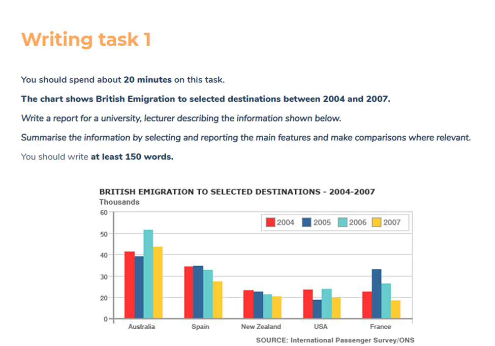
Top answer
??????? chart What kind of chart? ???????
- ???????
- chart What kind of chart?
- ???????
- gives us information about That is very vague.
- Tell the reader exactly what is plotted.
Get the Weekly English Kit 📬
New words, one handy idiom, and a 2-minute quiz — delivered to your inbox to keep your streak alive.
???????? ???????chart
What kind of chart?
???????? ??????? gives us information about
That is very vague. Tell the reader exactly what is plotted.
???????? ???????Emigration
The word is not a proper noun. Do not capitalize.
???????? ??????? five
 Related Questions