
Please review my IELTS essay
Topic: The pie chart below shows the percentage of ad spending by different kinds of media in India from 2012 to 2017. Summarise the information by selecting and reporting the main features, and make comparisons where relevant. Write at least 150 words. (The Charts: 2012: TV: 43%, digital 6%, cinema 1%, outdoor 5%, print 38%, radio 7%; 2017: TV 45%, digital 15%, cinema 1%, outdoor 5%, print 30%, radio 4%)
My essay:
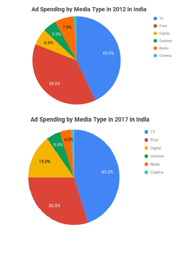
The given pie charts compare the expenditure on the commercial channel of various types in India between 2012 and 2017.
Overall, the price of television advertisement was the highest in both years and accounted for nearly half of the total expenditure. Following TV was the print segment, which was nearly a quarter on average. Opposite of that, the cinema remained the proportion after 5 years and was the least of the total in both two years.
The largest of spending for the media is Television and that remained the position for 5 years despite slightly increasing from 43% to 45%. In contrast, the digital cost was 6% in 2012 and significantly grew to 15% in 2017.
On the other hand, both print and radio became less popular after a half of decade. As such, two kinds were 45% which dropped to 34% in total. In particular, the proportion of Print fell from 38% to 30%. The cost of radio also nearly doubled declining to 4% in 2017.
Besides, the charge for Cinema and Outdoor advertisements stayed unchanged, with 5% on Outdoor and only 1% on Cinema.
Top answer
The given two pie charts compare five different advertising methods in terms of the expenditure on advertising using those the commercial channel of various types in India between 2012 and 2017. [ 1 ] Overall, TV and printed media accounted for more than three-quarters of both charts, and the share of digital advertising more than doubled over those five years. the price of television advertisement was the highest in both years and accounted for nearly half of the total expenditure.
- The given two pie charts compare five different advertising methods in terms of the expenditure on advertising using those the commercial channel of various types in India between 2012 and 2017.
- [ 1 ] Overall, TV and printed media accounted for more than three-quarters of both charts, and the share of digital advertising more than doubled over those five years.
- the price of television advertisement was the highest in both years and accounted for nearly half of the total expenditure.
- Following TV was the print segment, which was nearly a quarter on average.
- Opposite of that, the cinema remained the proportion after 5 years and was the least of the total in both two years .
Get the Weekly English Kit 📬
New words, one handy idiom, and a 2-minute quiz — delivered to your inbox to keep your streak alive.
The given two pie charts compare five different advertising methods in terms of the expenditure on advertising using those the commercial channel of various ty
 Related Questions