
Please review my IELTS essay
Topic: The graph below shows the amounts of waste produced by three companies over a period of 15 years
My essay:
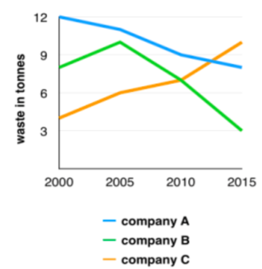
The line graph compares three organisations in terms of their waste output by tonnes through a 15-year period, since 2000.
Apparently, there were considerable changes produced by three businesses indicated on the chart. While organisation A and B saw the same trend which is the reduction in waste released between 2000 and 2015, company C’s amount increased significantly.
In 2000, company A produced the highest quantity of waste over the entire period by 12 tonnes, while business B and C released roughly 8 tonnes and 4 tonnes of waste material respectively. The following 5 years later, whilst the amounts of waste production made by organisation B and C grew by approximately 2 tonnes, the figure for company A fell by around 1 tonne.
From 2005 to 2010, company A cut waste production by almost 1 tonne, and the figure of waste that business B declined as three times as business A’s waste material decreased. By contrast, organisation C presented a boost in waste output of roughly a tonne. By 2015, while company C’s waste had grown to 10 tonnes, the respective amounts of waste from company A and B had dropped to 8 tonnes and only 3 tonnes.
Top answer
The line graph compares three organisations [ 1] companies in terms of their waste output by in tonnes [ 2 ] through a 15-year period, since from 2000 to 2015 . [ 3 ] Apparently, [ 4 ] there were considerable changes produced by three businesses indicated on the chart . Overall, w hile organisation companies A and B saw the same trend which is the a reduction in waste released over those years, between 2000 and 2015, company C’s amount waste increased significantly.
- The line graph compares three organisations [ 1] companies in terms of their waste output by in tonnes [ 2 ] through a 15-year period, since from 2000 to 2015 .
- [ 3 ] Apparently, [ 4 ] there were considerable changes produced by three businesses indicated on the chart .
- Overall, w hile organisation companies A and B saw the same trend which is the a reduction in waste released over those years, between 2000 and 2015, company C’s amount waste increased significantly.
- In 2000, company A produced 12 tonnes, the highest quantity of waste over in the entire perio d, [ 5 ] by 12 tonnes , while business B and C released roughly 8 tonnes and 4 tonnes of waste material respectively.
- Over t he following 5 year s, [ 6 ] later, [ 7 ] whilst while the amounts of waste production made produced by organisation B and C grew by approximately 2 tonnes, the figure for company A fell by around 1 tonne.
Get the Weekly English Kit 📬
New words, one handy idiom, and a 2-minute quiz — delivered to your inbox to keep your streak alive.
The line graph compares three organisations [ 1] companies in terms of their waste output by in tonnes [ 2] through a 15-year period, since from 2000 to 2015.
 Related Questions