
Please Review My IELTS Essay?
The chart shows the unemployment situation in Australia in the year 2012.
Summarise the information by selecting and reporting the main features, and make comparisons where relevant.
You should write at least 150 words.
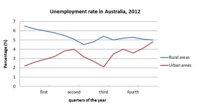
The given chart gives information on Australia's unemployment situation in four months of 2012 in percentage.
In general, the ratio of unemployees in urban areas saw an upward trend through quarters of the year. An opposite picture was seen in the rural areas’ unemployees ratio.
In detail, the proportion of Australian unemployees in rural areas plunged by twice in the first two months, and then increased slightly to 5,5% in the third month. Finally, it stayed unchanged at 5% in the fourth month.
When it comes to urban areas, more and more people are unemployed. The ratio of them was above 2% in the first month and it reached its highest point in the fourth month, about 4.9%.
Top answer
Lilingggg, that your posts are approved automatically means you have gained enough confidence in using the forums properly, but you are posting on the wrong forums. Please post your essays in our Essay Forum. htm I suggest you bookmark the above address so you wouldn't have much difficulty finding the Essay Forum.
- Lilingggg, that your posts are approved automatically means you have gained enough confidence in using the forums properly, but you are posting on the wrong forums.
- Please post your essays in our Essay Forum.
- htm I suggest you bookmark the above address so you wouldn't have much difficulty finding the Essay Forum.
Get the Weekly English Kit 📬
New words, one handy idiom, and a 2-minute quiz — delivered to your inbox to keep your streak alive.
Lilingggg, that your posts are approved automatically means you have gained enough confidence in using the forums properly, but you are posting on the wrong forums. Please post your essays in our Essay Forum.
The given chart gives information on Australia's compares the rural and urban unemployment rates situation in Australia in over the four months quar
 Related Questions