
Please review my IELTS essay
The graph below shows the usage of oil in four different countries between 1996 and 2006 as a percentage of total energy use within each nation.
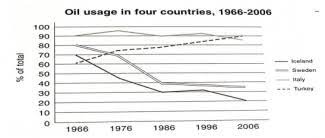
The provided line graph plots the proportion of oil consumption in four separate nations namely iceland, sweden, italy, turkey over a 40-year period from 1966 to 2006.
Overall, it is clear to see that the percentage of oil utilization in both Sweden and Iceland experienced a downward trend, as opposed to that of Turkey. Additionally, there were some slight shifts in the proportion of oil usage in Italy, which was, nevertheless, dominant among four mentioned countries throughout the period except for 2006.
In 1966, the proportion of oil usage in Italy was the highest, at a sizable 90%, followed by that of Sweden and Iceland, recorded at 80 and 70% respectively. Meanwhile, Turkish used 60% of oil resources, which was the lowest among 4 given countries. After a decade, there was a notable rise in the figure for oil consumption in Turkey to approximately three quarters whereas that of Sweden and Iceland was reserved. That of Italy, on the other hand, witnessed a slow drop and then varied continuously.
At the end of the timeline, Turkey’s rate stood out, accounting for 90 percent of total use, surpassing Italy’s at roughly 85%. Sweden people consumed much less oil energy than Italy people and not as much as them used to. A similar pattern was repeated for Iceland.
Top answer
That picture is too small. Can you attach a larger version?
- That picture is too small.
- Can you attach a larger version?
Get the Weekly English Kit 📬
New words, one handy idiom, and a 2-minute quiz — delivered to your inbox to keep your streak alive.
 Related Questions