
Please review my IELTS essay
My essay:
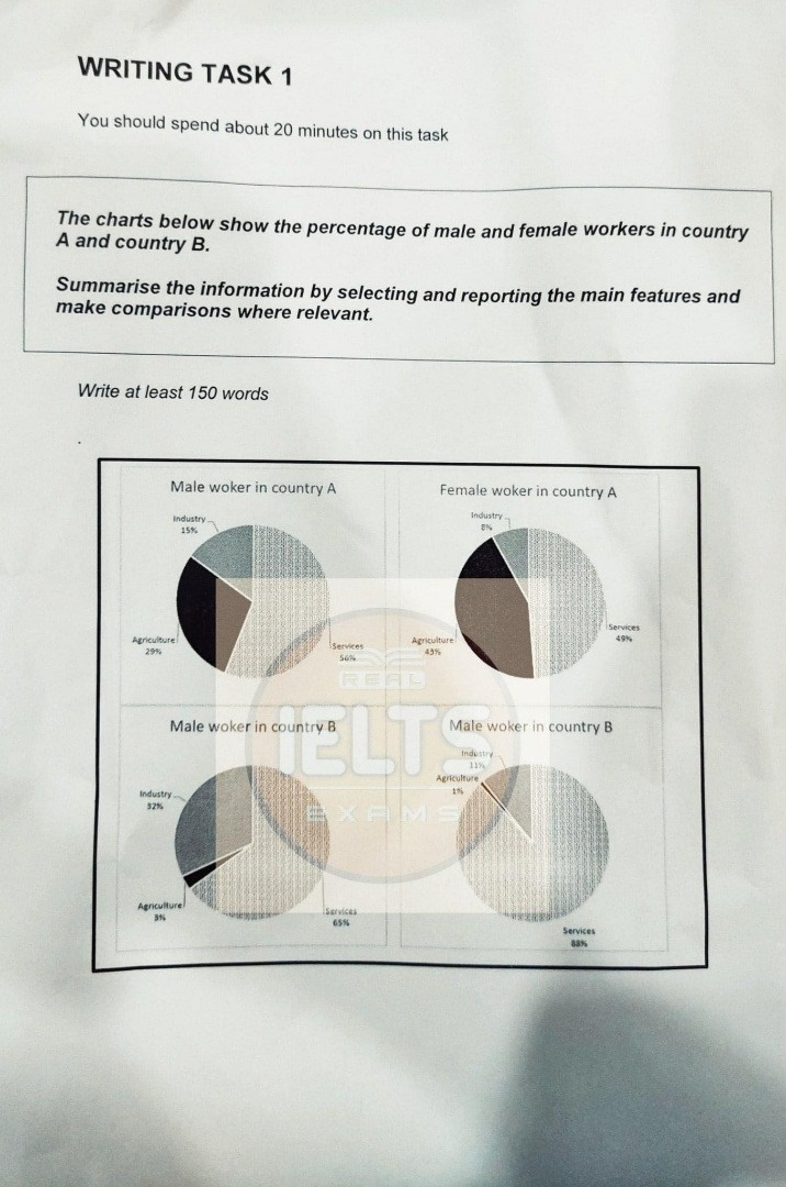
The pie graphs illustrate the proportion of men and women working in two different countries.
At first sight, it can be clearly seen that in both countries, most of men and women were service workers. Meanwhile, there was a wide gap between the percentage of industrial and agricultural workers, especially that of women in country A.
The initial impression of the charts is that the percentages of male and female workers in services were remarkably high in country A, making up almost half of the total share. Besides, there were 29 percent of men and 43 percent of women working in agricultural sector. Meanwhile, only 8 percent of women worked as industrial workers and that of men was 15 percent. Experiencing the same pattern as country A, country B had more than two-thirds of male service workers and considerably nearly 90 percent of female service workers. Whereas 32 percent and 3 percent of man were industrial and agricultural workers, these proportions of women were extremely low, respectively accounting for 11 percent and 1 percent.
Top answer
The pie graphs illustrate the proportion s of men and women working in agriculture, services, or industry in two different countries. [ 1] At first sight, it can be clearly seen that in both countries, Overall, most [ 2 ] of men and women in both countries work in the service sector, and were service workers. Meanwhile, there [ 3 ] is was a wide gap between the percentage s of industrial and agricultural workers, especially that of for women in country A.
- The pie graphs illustrate the proportion s of men and women working in agriculture, services, or industry in two different countries.
- [ 1] At first sight, it can be clearly seen that in both countries, Overall, most [ 2 ] of men and women in both countries work in the service sector, and were service workers.
- Meanwhile, there [ 3 ] is was a wide gap between the percentage s of industrial and agricultural workers, especially that of for women in country A.
- [ 1] The initial impression of the charts is that T he percentages of male and female workers in services were are remarkably high in country A, making up [ 4 ] almost around half of the total share.
- Besides, there were [ 5 ] 29 % percent of men and 43 % percent of women wor k ing in the agricultural sector there .
Get the Weekly English Kit 📬
New words, one handy idiom, and a 2-minute quiz — delivered to your inbox to keep your streak alive.
The pie graphs illustrate the proportions of men and women working in agriculture, services, or industry in two different countries.
[ 1] At first sight, it can be clearly seen that in both countries, Overall, most [ 2]
 Related Questions