
Please review my IELTS essay
Topic :
The chart illustrates housing preferences among people who lived in the British cities of London, Oxford and Cambridge in the year 2005. Summarize the needed information in 150 words
My essay :
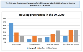
The following chart illustrates the percentage of British housing preferences in 4 different categories in 3 big cities of the UK - Liverpool, London and Manchester, in 2009.
Generally, living in apartments was the most popular choice among Liverpool residents, while people living in London and Manchester showed their interest in detached and semi-detached houses. In contrast, the lowest references belonged to terraced houses in all of 3 cities.
In this period of time, the chart was clear to be seen that nearly 60% respondents in Liverpool preferred flats, which was almost doubling and tripling of responses from London and Manchester respectively. On the other hand, there was an opposite trend while terraced houses was the less popular recommendation with less than 20% from London and around 10% from Manchester and Liverpool.
Having the view on semi-detached houses, there was an equal percentage of preferences, almost 40%, from citizens in Manchester and London while Liverpool was two times lower than these cities. Meanwhile, detached houses had 35% of preferences from citizens in Manchester which was about 10% and 20% higher in comparison with London and Liverpool respectively.
Top answer
Sorry, but the writing on that diagram is impossible to read. Not only do you have to post an image, but it has to be larger than a postage stamp.
- Sorry, but the writing on that diagram is impossible to read.
- Not only do you have to post an image, but it has to be larger than a postage stamp.
Get the Weekly English Kit 📬
New words, one handy idiom, and a 2-minute quiz — delivered to your inbox to keep your streak alive.
Sorry, but the writing on that diagram is impossible to read. Not only do you have to post an image, but it has to be larger than a postage stamp.
 Related Questions