
Please review my IELTS essay
The chart gives information about the merit of a number of diverse export products in 2015 and 2016. The table illustrates the change of proportion in every product of export in comparison of 2016 and 2015.
Overall, it is clear that the values of petroleum and engineered products were greatest in both 2015 and 2015, while other products only peaked at under 50 billion. These figures were transformed into percent given by the table.
Looking at the chart and the table more closely, one can see that there was a slighter increase in petroleum products value, about 3 billion, compared to the engineered goods, this figure in proportion to 5,5% difference, however, both categories reached over 60 billion in 2016. Besides, while the value of gems and jewelry decreased about 5,18% equally to 4 billion, the textiles went up markedly about 15,24% and peaked at over 30 billion. The agricultural products remain almost constant in both 2015 and 2016, with around 30 billion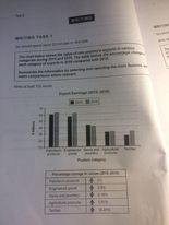
Top answer
Sorry, your image is impossible to make out. It is out of focus and very small. So I cannot give you much feedback.
- Sorry, your image is impossible to make out.
- It is out of focus and very small.
- So I cannot give you much feedback.
- There are many misused words and phrases in the first paragraph; I have highlighted them in yellow below.
- But I cannot see the image well enough to suggest better ones.
Get the Weekly English Kit 📬
New words, one handy idiom, and a 2-minute quiz — delivered to your inbox to keep your streak alive.
Sorry, your image is impossible to make out. It is out of focus and very small. So I cannot give you much feedback. There are many misused words and phrases in the first paragraph; I have highlighted them in yellow below. But I cannot see the image well enough to suggest better ones.
There are no peaks at all. You can only have peaks in line graphs and time series
The chart (What kind of chart is this? Is it a pie chart, an organization chart, an eye chart, or another kind of chart?) gives information about (That is very vague an uninformative. What is exactly on this chart?) the merit (That is co
 Related Questions