
Please review my IELT essay : Writing task 1: International migration in UK
My essay:
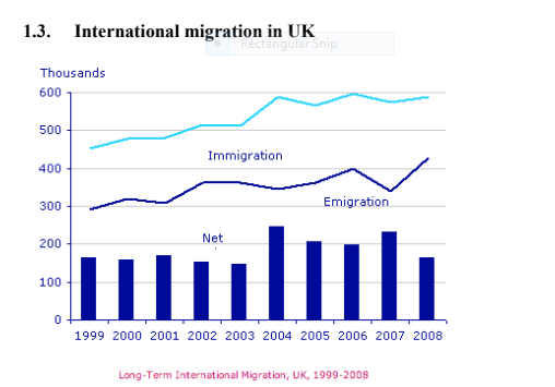
The chart provides the information about the number of people who came to live and left in UK and gives the net migration figures during the period from 1999 to 2008.
It is immediately apparent from this chart that the trend of both immigration and emigration rates were upward. However, the number of immigation were always higher than emigration. It is also noticeable that net migration got a peak in 2004 and 2007.
In 1999, the number of people immigrating to UK were about 450,000 and were considerably higher comparing to the figures for emigration, almost 290,000. As a result, the figures for the net migration were about 160,000. From 1999 to 2004, the immigration rates increased noticaebly to approximately 600,000 and rose nearly 150,000 in comparision with 1999. However, there was a much smaller increase in emigration with about 60,000 people left UK to live in another countries. The net migration during this period fluctuated slightly and climbed sharply to almost 250,000 in 2004.
After 2004, the number of immigration witnessed a slight fluctuation and remained standing just under 600,000 in 2008. The rate of emigration remained high but declined suddenly in 2007 before peaked in 2008 wwith about 420,000 people emigrating out of UK. Thus, this led to a wild fluctuation in the net migration figures around 240,000 in 2007, but fell back to about 160,000 in 2008, just same as the figures at the begining time.
Top answer
Nice
- Nice
Get the Weekly English Kit 📬
New words, one handy idiom, and a 2-minute quiz — delivered to your inbox to keep your streak alive.
The chart two line graphs provide s the information about the number of people who came immigrated to live and left in those who emigrated from the UK and gives the
 Related Questions