
Please review my essay? Thank you so much!:)
Essay:
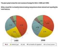
The pie charts illustrate how the proportion of energy production from five different sources for the USA changed in two different years (1980 and 1990).
Overall, oil constituted the major source of energy in both two years while hydroelectric power was the least popular. There was a slight drop in the percentages of oil and natural gas,whereas the production of nuclear power and coal saw an increase over the period.
The amount of energy produced from oil in the USA accounted for 42% in 1980 and then rose to just over a third in 1990.The proportion of hydroelectric power, by contrast, remained constant throughout the period at a tiny fraction (5%).
The energy generated from natural gas which was the second most common source in 1980 (at 24%) witnessed a slight decrease of 1% to exactly a quarter over the next ten years. On the other hand, the figure for nuclear power doubled from 5% to 10% in 1980 and 1990 respectively. Likewise, there was a growth of 5% in the percentage of energy manufactured from coal, reaching 27% in the final year.
Get the Weekly English Kit 📬
New words, one handy idiom, and a 2-minute quiz — delivered to your inbox to keep your streak alive.
 Related Questions