
Please review my essay. Thank you.
The chart and graph below give information about participants who have entered the Olympics since it began.
Summarize the information by selecting and reporting on the main features, and make comparisons were relevant.
My essay:
The line graph shows the participants who have been in the Olympics since it started, while the bar chart gives information about gender and the number of athletes in Olympic games for four years (1924, 1952, 1984 and 2012).
Overall, the number of athletes increased significantly since 1924, especially for women.
In the bar chart, the most important thing is difference between number of men and women athletes. There were always dramatically more men participants than women, until 2012. In 1924, only about 100 females participated in the Games, whereas there were 3,000 male participants. The number increased for both groups (men and women), but the difference was still significant in both genders, until 1984. However, the number of females experienced a substantial rise in 2012 (about 4,800) and the men were just about 1,100 over than the women.
In the line graph, we can see that the number of 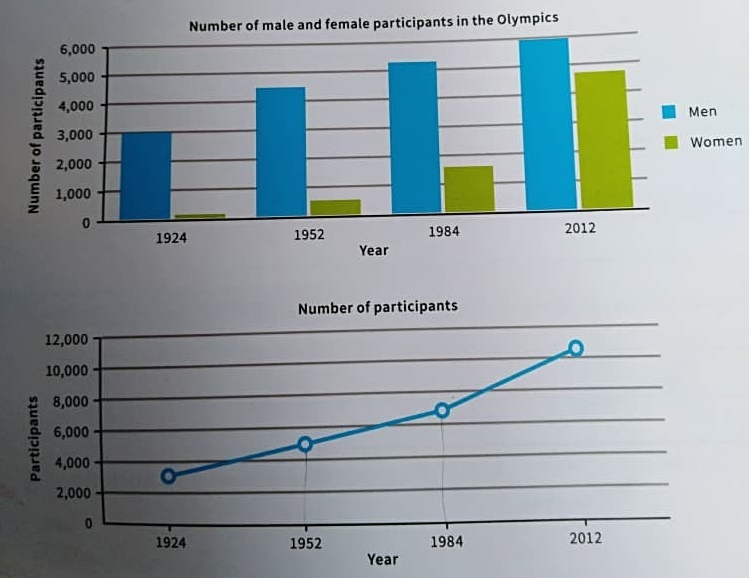
all gamers rose in these years. The most increase occurred between 1984 and 2012. The athletes increased from over 6,000 to a little over 10,000.
Top answer
The line graph shows the participants (Incorrect. g. Uriah Bolt, a runner, Maziah Mahusin, a hurdler, and Charlotte Cooper, a tennis player) who have been in the Olympics since it started , (incorrect.
- The line graph shows the participants (Incorrect.
- g.
- Uriah Bolt, a runner, Maziah Mahusin, a hurdler, and Charlotte Cooper, a tennis player) who have been in the Olympics since it started , (incorrect.
- ) while the bar chart gives information about (That is very vague.
- ) gender and the number of athletes in Olympic games for four years (1924, 1952, 1984 and 2012).
Get the Weekly English Kit 📬
New words, one handy idiom, and a 2-minute quiz — delivered to your inbox to keep your streak alive.
The line graph shows the participants (Incorrect. It does not show the participants, e.g. Uriah Bolt, a runner, Maziah Mahusin, a hurdler, and Charlotte Cooper, a tennis player) who have been in the Olympics since it started, (incorrect. The modern games started in 1896.) while the bar c
 Related Questions