
Please, Review My Essay for IELTS Task 1. Thanks a lot
Topic: The graph below shows the number of shops that closed and the number of new shops that opened in one country between 2011 and 2018.
Summarise the information by selecting and reporting the main features and make comparisons where relevant.
My essay:
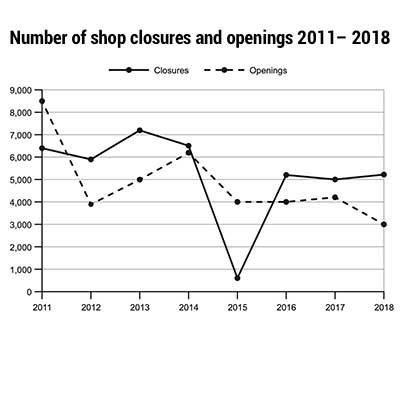
The line graph shows the trends of shop closures and openings in a particular country between 2011 and 2018. The continuous and discontinuous line represents the number of closed and opened shops, respectively.
Overall, the number of closing shops remained in the range between 7000 and 5000, apart from a significant drop in 2015. The number of shop openings was marked with two stable periods, separated by three sharp falls.
In 2011, there were approximately 64000 shops closed. This number fluctuated between around 6000 and 7100 in the next three years, then returned to a similar value in 2014. A sharp fall happened in 2015, with the number of shop closures plummeting down to as low as 600 and rebounding back up to 5100 in the next year. From 2016 to 2018, there were no significant changes.
The number of shop openings started at around 8500 in 2011, which saw a significant drop of more than 50% to approximately 4000 in 2012. This number steadily rose to 6000 in the next two years but was cut back down to 4000 in 2015 and remained around the same value for another two years. The last fall happened in 2018, with the number of shop openings reaching a low of 3000.
Top answer
[ 1] The line graph [ 2 ] shows the trends tracks the number (in thousands) of shop s closures that opened and openings of those that closed in a particular country [ 3 ] area between 2011 and 2018. The continuous and discontinuous line represents the number of closed and opened shops, respectively. [ 4 ] Overall, both graphs declined, but the one for closures had a major dip in the middle.
- [ 1] The line graph [ 2 ] shows the trends tracks the number (in thousands) of shop s closures that opened and openings of those that closed in a particular country [ 3 ] area between 2011 and 2018.
- The continuous and discontinuous line represents the number of closed and opened shops, respectively.
- [ 4 ] Overall, both graphs declined, but the one for closures had a major dip in the middle.
- the number of closing shops remained in the range between 7000 and 5000, apart from a significant drop in 2015.
- The number of shop openings was marked with two stable periods, separated by three sharp falls.
Get the Weekly English Kit 📬
New words, one handy idiom, and a 2-minute quiz — delivered to your inbox to keep your streak alive.
[ 1] The line graph [ 2] shows the trends tracks the number (in thousands) of shops closures that opened and openings of those that closed in a particular country
Comment:
To get a very good score on this essay, you have to point out the differences between the two curves. If you just focus on each curve separately and copy numbers from the graph to your essay, your score will be capped.
For example:
In 2011, there were 2100 additional stores in the country; even though 6400 went out of business, 8500 more were cr
 Related Questions