
Please review my essay and estimate band score for this writing task 1, thank you
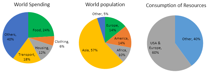
The pie charts below give data on the spending and consumption of resources by countries of the world and how the population is distributed.
Summarize the information by selecting and reporting the main features, and make comparisons where relevant.
ANSWER:
The three given pie chart illustrates the proportion of people on worldwide consumed various resources in 4 nations and unspecified
Overall, Asia dominated in the proportion of consumers and the lowest belongs to uncategorized nations that spending the most on unspecified item and clothing was the item that was spent the least. Meanwhile, the data also showed the USA & Europe consumed resources higher than others.
In particular, the USA and Europe had a higher proportion of consumption than other nations with 60% and 40% respectively. Among 5 categories of countries, Asia has the highest rate of population with 54% that spending money on 5 fields which was listed in the study, the second highest population density belonged to Europe and America which as high as each other with 14%. the third position belonged to Africa with 10%. The bottom of the ranking was undefined nations with 5%.
As can be seen, leading the ranking was the unspecified category accounted for 40% higher 16% than food which was only 24%. Following by transport lower 6% than food and ranked 3rd. Ranked 4th belonged to housing which just reached 12%. Finally, people tend to spend the least money on clothes which made clothing ranked at the bottom of the ranking with 6%.
Get the Weekly English Kit 📬
New words, one handy idiom, and a 2-minute quiz — delivered to your inbox to keep your streak alive.
 Related Questions