
Please review my essay
Essay topics:
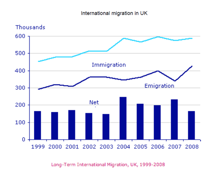
The graph below shows Long-Term International Migration in UK, 1999-2008.
Summarize the information by selecting and reporting the main features, and make comparisons where relevant.
My essay:
The line graph compares the number of people who come in and out of the UK from 1999 to 2008. The bar chart plots the annual net migration over the same period.
Overall, both curves, immigration and emigration, increased over time. The net migration was into the country each year, with an average of about 180 thousand.
In detail, in 1999, about 450,000 people immigrated to the UK, and 300,000 emigrated, the net migration being 160,000; it remained around that level during the first five years and decreased slightly to 150,000 in 2003. That was due to immigration being highly positively correlated with emigration, but with a smaller rise, 50 versus 80 thousand. After that, the number emigrating dropped marginally to 350,000 in 2004, with a peak of 400,000 in 2006 and its endpoint of 420,000. In contrast, that of immigrating peaked at nearly 600,000, and then varied by only 2%, ending with exactly the same as in 2004. As a result, the net migration reached its highest points of 250 and 240 thousand in 2004 and 2007, respectively. By 2008, it declined back to when it was in 1999, 170,000.
Could you post a sample essay, please? I’m really, really grateful.
Top answer
The line graph compares the number of people who come in and out (That is incorrect. Travelers on business or vacation or to visit family come in and out. They are not immigrants or emigrants.
- The line graph compares the number of people who come in and out (That is incorrect.
- Travelers on business or vacation or to visit family come in and out.
- They are not immigrants or emigrants.
- ) of the UK from 1999 to 2008.
- The bar chart plots the annual net migration over the same period.
Get the Weekly English Kit 📬
New words, one handy idiom, and a 2-minute quiz — delivered to your inbox to keep your streak alive.
The line graph compares the number of people who come in and out (That is incorrect. Travelers on business or vacation or to visit family come in and out. They are not immigrants or emigrants. These people leave permanently to settle in a different country.) of the UK from 1999 to 2008. The bar chart plots the annual net migration over
The graph plots the numbers of UK emigrants and immigrants each year between 1999 and 2008. Bars on this graph show the annual difference between the two.
Overall, there was a net immigration every year and both curves showed rising levels of migration in both directions. Because the curves were positively correlated, the net, or difference between them, did not have any distinct trend.
 Related Questions