
Please review my essay
My topic: The graph below shows the percentage of Australian exports to 4 countries from 1990 to 2012
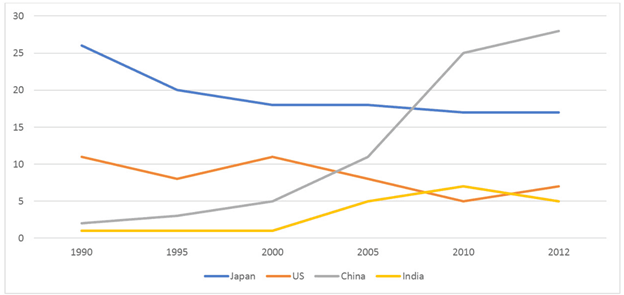
My essay: The line graph compares four countries, namely Japan, US, China and India in terms of the proportion of imported Australian products during the period from 1990 and 2012.
In general, an upward trend was observed for the China’s and India’s percentages. However, it was not the case for Japan and America.
In 1990, Japan took the lead across all nations, with more than a quarter of products from Australia were sold, followed by the US (11%). The percentages of exports to China and India were pale in comparison, at 3%. After a decade, there was a gradual decrease of 10% in the Japan’s percentage and it stayed stagnant until the end of period, while Australia exported 5% of its goods to China. There was no change in America’s and India’s, despite a slight dipping for the former in 1995.
From 2003 onwards, the most notable change was shown for China’s percentage, as exports to it had a sharp increase, overtaking Japan as primary overseas market for Australia (27%). Similarly, that of India rose to 7% in 2010 before dropping to 5% in 2012, the least popular Australia’s market. American percentage declined to 5% mark in 2010
Get the Weekly English Kit 📬
New words, one handy idiom, and a 2-minute quiz — delivered to your inbox to keep your streak alive.
 Related Questions