
Please review my essay
Topic: The charts below give information about USA marriage and divorce rates between 1970 and 2000, and the marital status of adult Americans in two of the years.
My essay:
The first bar chart illustrates changes in American marriages and divorces and the accompanying bar chart demonstrates the marital status among the adults in the US over a 30-year period starting from 1970.
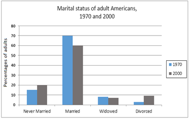
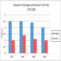
In general, there was a significant decrease in the number of married inhabitants whereas the divorce rates varied dramatically over the period. Additionally, although the majority of American citizens were married in both years, there was a quite higher proportion of adults staying single in 2000.
In 1970 and 1980, 2.5 million people had a marriage life while the number of people breaking up increased dramatically, reaching the peak at approximately 1.5 million in 1980. The years from 1980 to the end of the century was characterized by a marginal decline in both marriage and divorce rates, 2 million and 1 million respectively in 2000.
Moving on to the second picture, the percentage of married American declined by 10% after 3 decades. Similarly, there was a slight fall when it comes to the widowed. In contrast, the percentage for never-married individuals and divorced couples rose significantly, by 5% and 8% respectively.
Top answer
The first bar chart illustrates c hanges in American marriages and divorces and the accompanying bar chart demonstrates the marital status among the adults in the US over a 30-year period starting from 1970. Your descriptions are not accurate. Do not use "illustrate" or "demonstrate" for plots.
- The first bar chart illustrates c hanges in American marriages and divorces and the accompanying bar chart demonstrates the marital status among the adults in the US over a 30-year period starting from 1970.
- Your descriptions are not accurate.
- Do not use "illustrate" or "demonstrate" for plots.
- You used it in your previous essay, too, remember?
- It is still wrong.
Get the Weekly English Kit 📬
New words, one handy idiom, and a 2-minute quiz — delivered to your inbox to keep your streak alive.
The first bar chart illustrates changes in American marriages and divorces and the accompanying bar chart demonstrates the marital status among the adults in the US over a 30-year period starting from 1970.
 Related Questions