
Please review my essay
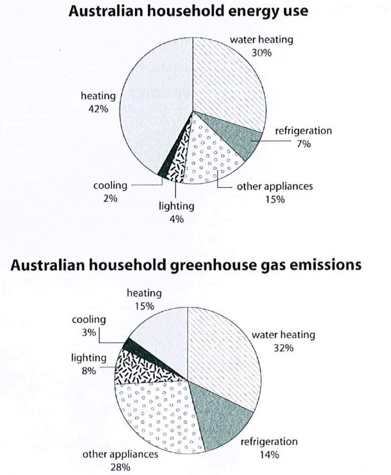
The first pie chart plots the usage of energy in a typical Australian household. Energy is used for heating, water heating, cooling, lighting and refrigeration. The remainder, representing others, is lumped into “other appliances”. The second pie chart depicts how much greenhouse gas emissions emitted from these energy.
Overall, the percentages of emission released from these energy are generally higher than that of the usage of them, except for heating, which is the most environmentally friendly activity. Other appliances are the greatest emitter.
Heating and water heating made up the largest fraction in both charts, amounting to a half and a quarter in the total energy consumption, and nearly a half in the total gas emissions. However, these are the most sustainable energy; the amount of gas emitted from water heating is only 2% higher than that of its usage, and as for heating, that amount is roughly one-third of its usage.
Cooling and lighting take up the smallest in both charts, with 2% and 4% in energy consumption and 3% and 8% in the amount of gas emissions.
Other appliances and refrigeration are the most harmful energy; the amount of gases they released is double that of their usage, with 15% and 7% in energy consumption and 28% and 14% in household gas emissions.
Top answer
The first pie chart plots the usage of the proportion of energy used per type of appliance in a typical Australian household. Six types are shown: ; Energy is used for heating, water heating, cooling, lighting and refrigeration. The remainder , representing others, is lumped into “other appliances”.
- The first pie chart plots the usage of the proportion of energy used per type of appliance in a typical Australian household.
- Six types are shown: ; Energy is used for heating, water heating, cooling, lighting and refrigeration.
- The remainder , representing others, is lumped into “other appliances”.
- The second pie chart depicts how much the proportion of greenhouse gas emissions emitted from these types of appliances.
- energy .
Get the Weekly English Kit 📬
New words, one handy idiom, and a 2-minute quiz — delivered to your inbox to keep your streak alive.
The first pie chart plots the usage of the proportion of energy used per type of appliance in a typical Australian household. Six types are shown: ;Energy is used for heating, water heating, cooling, lighting and refrigeration. The re
 Related Questions