
Please review my essay
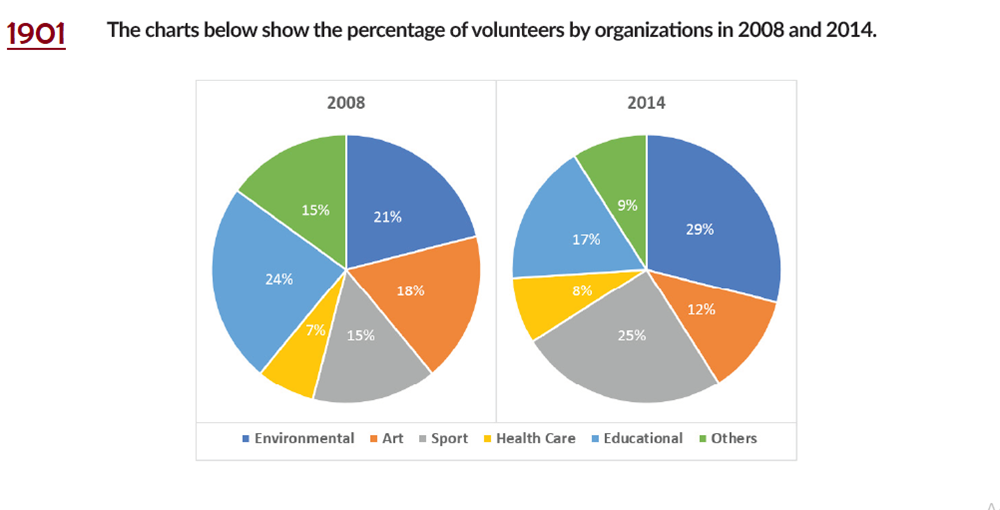
The pie chart plot the proportion of people volunteering in six organizations: Environmental, Art, Sport, Health Care, Educational, and Others in 2008 and 2014.
Overall, the rank order of the six organizations changed by the year 2014, except for Health Care. The most significant rise can be seen in Sport, and the sharpest decrease in Educational.
Educational made up the largest fraction in 2008, about a quarter of the total volunteers. By 2014, its percentage decreased to 17%, the third largest in that year. Environmental accounted for the second largest in 2008 and the greatest in 2014, starting at around 21% and ending at 29%. In both years, this percentage always tripled that of Healthcare organization. Being the third largest in 2008 was Art, with just under 20%. By 2014, It had lost its ground and fell to the fourth largest, 12%.
The steepest growth can be seen in Sport organization, standing at around one-sixth in 2008 and ending at a quarter of the total volunteers. Others organization captured a similar percentage to that of Sport in 2008, and that was roughly double the proportion of Health Care. However, by 2014, its declined to 9%, nearly the same that of Health Care.
Top answer
The pie chart plot (subject/verb mismatch. ) Environmental, Art, Sport, Health Care, Educational, and Others in 2008 and 2014. The two pie charts, one for 2008 and the other for 2014, compares the proportion of volunteers by type of organization.
- The pie chart plot (subject/verb mismatch.
- ) Environmental, Art, Sport, Health Care, Educational, and Others in 2008 and 2014.
- The two pie charts, one for 2008 and the other for 2014, compares the proportion of volunteers by type of organization.
- The five types are Environmental, Art, Sport, Health Care, and Educational.
- " Overall, the rank order of the six organizations (There are only five categories or types.
Get the Weekly English Kit 📬
New words, one handy idiom, and a 2-minute quiz — delivered to your inbox to keep your streak alive.
The pie chart plot (subject/verb mismatch. Also, there is more than one pie chart!) the proportion of people volunteering in six organizations: (There are not six specific, named organizations.) Environmental, Art, Sport, Health Care, Educational, and Others in 2008 and 2014.
 Related Questions