
Please review my essay.
Topic: The bar chart shows the percentage of adults who were overweight or obese (too fat or much too fat) in one country from 1965 to 2015. The pie shows the proportion of adults who were overweight, obese or severely obese in 2015.
summarize the information by selecting and reporting the main features, and make comparison where relevant.
Write at least 150 words. 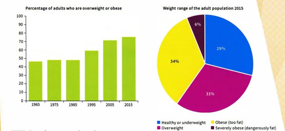
My essay:
The bar graph gives information about the number of adults in a country who were overweight or obese between 1965 and 2015, while the pie chart compares the weight range of the adult population in 2015. As shown, the percentage of the adults rose during 1965-2015. According to the pie chart, obese and overweight adults have the most population.
In order to the bar chart, the percentage of the adults rose from a little above 45% in 1965 to a little under 80% in 2015. In the first 20 years, the number has remained about stable at around 50%. The next ten-year period shows the first significant increase, about 10%. In the ten-year period after that, the increase in the population is approximately the same ten years ago. There has been a steady increase. The last decade shows a slight increase, but just over than 5% less than two decades ago.
The pie chart represents us that the obese and overweight adults have the largest number, just over a third. the overweight are in second place by 31%. The adults who were dangerously fat account for a tiny proportion, 6%. Their number is a little under a sixth largest group (too fat adults). 29% of the adults are healthy or underweight. On the whole, their population is just about a third obese, overweight and severely obese adults.
Top answer
We have given you a lot of help, but not one time have you thanked us. Why should we do the thankless work of spending time with your essays when there are many more students waiting for help?
- We have given you a lot of help, but not one time have you thanked us.
- Why should we do the thankless work of spending time with your essays when there are many more students waiting for help?
Get the Weekly English Kit 📬
New words, one handy idiom, and a 2-minute quiz — delivered to your inbox to keep your streak alive.
We have given you a lot of help, but not one time have you thanked us. Why should we do the thankless work of spending time with your essays when there are many more students waiting for help?
The bar graph gives information (be precise. What does the bar chart plot?) about the number (wrong word. - A number is a value like 35 million.) of adults in a country who were overweight or obese between 1965 and 2015, while the pie chart compares the
 Related Questions