
Please review my essay
The graph below shows the proportion of the population aged 65 and over between 1940 and 2040 in three different countries.
Summarise the information by selecting and reporting the main features, and make comparison where relevant.
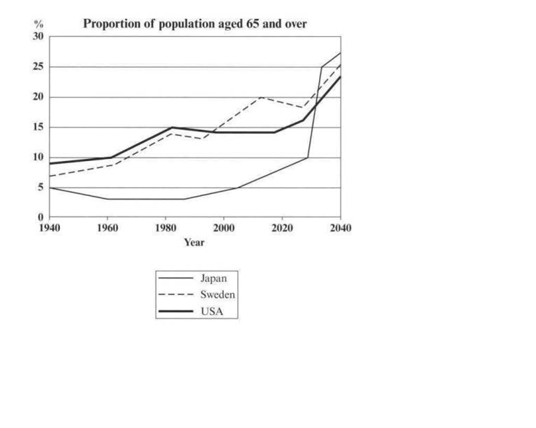
The graph indicates the ratio of the population aged 65 and over between 1940 and 2040 in three different countries.
In general, three countries have the old that increases over a century. the USA and Sweden people gradually rise up percent at this age but the Japanese have a sharply increasing about the ratio of old.
In particular, from 1940 to 2030 Japanese old is the lowest proportion with 5 percent in 1940, after that, this figure decreased slightly to 3 percent in 1985 and increase to 10 percent in 2030. From 2030 to 2040, the Japanese old dramatically increase from 10 to 27 percent. On the other hand, USA people gradually grew from approximately 9 to 15 percent from 1940 to 1982 and this figure remains stable from 1982 to 2020, from 2020 to 2040, American old show the sharply increasing from 15 to almost 24 percent. The last countries that have the old people in the graph indicate the rapidly rising from approximately 7 to 9, from 13 to 20 and from 19 to 25 in the period 1940 -1982, 1995 – 2010, 2025-2040 respectively. In the other period, this figure remains stable.
Get the Weekly English Kit 📬
New words, one handy idiom, and a 2-minute quiz — delivered to your inbox to keep your streak alive.
 Related Questions