
Please review my essay
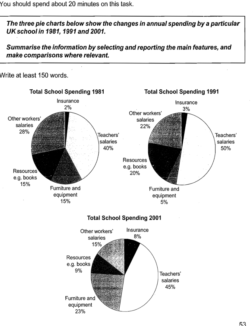
The three pie charts above give information about the annual changes of total school spending in different categories which are insurance, teachers’ and other workers’ salaries, school furniture and learning equipment, learning resources. The pie charts compare the data of a specific UK school in 1981, 1991 and 2001.
Coming first, being the major spending part, teachers’ salaries accounted for the vast majority 40% of the total school spending in 1981. This section showed an increase to 50% in 1991, then it slightly decreased in the percentage of 45% in the year of 2001. To be in the same token, the figures for teaching resources made up 15% in total in 1981. Although it was up to 20% in 1991, it also fell to only 5% in 2001.
Following that, furniture and equipment part fluctuated constantly according to the 3 periods of time. This section occupied 15% of the total school expenditure in 1981, but then it sharply declined to 5% in 1991. However, in 2001, it rose to 23% in total amount of money.
The figures for insurance took up for the smallest parts in the year of 1981 and 1991, 2% and 3% respectively. Dramatically, it rose to 8% in 2001. Besides, the figures for the other workers’ salaries gradually reduced by 13% in those mentioned years.
Top answer
The three pie charts above show give information about the annual changes (Annual changes = changes every year; 1981, 1982, 1983, 1984, etc. ) of total school spending in different categories which are (use a colon instead) insurance, teachers’ and other workers’ salaries, school furniture and learning equipment, (missing word) learning resources. The pie charts compare the data of a specific UK school in 1981, 1991 and 2001.
- The three pie charts above show give information about the annual changes (Annual changes = changes every year; 1981, 1982, 1983, 1984, etc.
- ) of total school spending in different categories which are (use a colon instead) insurance, teachers’ and other workers’ salaries, school furniture and learning equipment, (missing word) learning resources.
- The pie charts compare the data of a specific UK school in 1981, 1991 and 2001.
- Coming first, being the major spending part, teachers’ salaries accounted for the vast majority (missing punctuation) 40% (missing punctuation) of the total school spending in 1981.
- This section showed an increase to 50% in 1991 , (wrong punctuation) then it slightly decreased (decreased slightly) to in the percentage of 45% in the year of 2001.
Get the Weekly English Kit 📬
New words, one handy idiom, and a 2-minute quiz — delivered to your inbox to keep your streak alive.
The three pie charts above show give information about the annual changes (Annual changes = changes every year; 1981, 1982, 1983, 1984, etc. That is not what the chart shows.) of total school spending in different categories which are (use a colon instead) insurance, teachers’ and other workers’ salari
 Related Questions