
Please review and comment on my essay.
The graph below shows changes in young adult unemployment rates in England between 1993 and 2012.
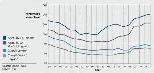
The line graph compare proposed changes about the proportion of the unemployed in different categories within 19 years from 1993 to 2012.
In general, the group of people whose age fluctuate from 16 to 24 in London and rest of England reached the highest increase at the beginning of 1993 to the end of 2012. Furthermore, both four categories got the similar trend during the period.
Looking for more details in the statistics, the rate of unemployment in London was still much higher than rest of England which is approximately 23% in aged 16-24 London and 14% in overall London compared with the others at 17% and 10% respectively. However, to the following of 10 years, The unemployment rates were significantly decreased. There were a remarkable volatility for the people who were out of work in London from 1993 to 2002 especially in young group about 15% in 2002.
On the contrary, during the last 10 years shown in the graph, More people weren't able to get the jobs and generally, It was an upward trend for all groups. In addition to that, the youth in 16-24 at London and rest of England reached a peak in 2012 at over 25% and 20%, while people who did't have jobs just about under 10% in overall.
P/s : Can you give me some useful tips to write better in line graphs? Thank you so much, I will appreciate that
Top answer
html Notice that this site has a sidebar menu for accessing all historic Task 1 lessons. The line graph compare [ basic grammar error with verb here ] proposed [ "proposed" would refer to the future: but the data is about the past already. ] -> The line graph shows the incidence of overall unemployment ,and youth unemployment, for England as a whole, and for the London area over the two decades to 2012.
- html Notice that this site has a sidebar menu for accessing all historic Task 1 lessons.
- The line graph compare [ basic grammar error with verb here ] proposed [ "proposed" would refer to the future: but the data is about the past already.
- ] -> The line graph shows the incidence of overall unemployment ,and youth unemployment, for England as a whole, and for the London area over the two decades to 2012.
- In general, the group of people whose age fluctuate [ People's age can never fluctuate, although sometimes I feel like I'm twenty-three again.
- ] from 16 to 24 in London and rest of England reached [ had ]the highest increase at the beginning of 1993 to the end of 2012.
Get the Weekly English Kit 📬
New words, one handy idiom, and a 2-minute quiz — delivered to your inbox to keep your streak alive.
Tips on writing line graphs by ex-examiner:
https://ielts-simon.com/ielts-help-and-english-pr/2017/05/ielts-writing-task-1-line-graph-answer.html
https://ielts
The line graph compare (wrong form) proposed (wrong word. proposed means something planned for the future. Is 1993 in the future?) changes about (wrong word) the proportion of the unemployed in different
 Related Questions