
Please I need your feedback
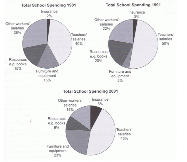
The three pie charts compare the percentage of yearly spending on insurance, teacher’s salaries, furniture and equipment, resources e.g books, other workers' salaries by a specific UK school. The given years are 1981,1991 and 2001.
Overall, in all three years, the biggest expenditure was on teacher’s salaries, whereas insurance constituted the smallest cost, less than 10%. Additionally, the cost of other staff’s salaries decreased over those years.
In 1981, the cost of teachers’ pay was 40%, which was 20 times higher than that of insurance, and after that 10-20 years, though the cost of insurance did rise slightly, the situation still did not change, the percentages of teacher’s salaries were still higher than that of insurance by a large margin; 50% and 45% compared to 3% and 8%.
Initially, spending on resources and furniture & equipment were equal, standing at 15%. By 1991, the proportion of resources had increased to 20% after showing a significant drop to 9% by the end of the period. An opposite trend to this can be witnessed in that of furniture and equipment, with 5% in 1991 and 23% in 2001.
The cost of other staffs’ salaries declined gradually over those three years, from being the second greatest cost, 28% in 1981 to the third largest, 15% in 2001.
Top answer
g books, other workers' salaries by a specific UK school. The given years are 1981,1991 and 2001. (You need to connect the three years more tightly to the three charts.
- g books, other workers' salaries by a specific UK school.
- The given years are 1981,1991 and 2001.
- (You need to connect the three years more tightly to the three charts.
- This is easy to do in the first sentence.
- Consider this opening sentence: The three pie charts, dated 1981, 1991 and 2001, compare the percentage of yearly spending in one UK school on five budget categories.
Get the Weekly English Kit 📬
New words, one handy idiom, and a 2-minute quiz — delivered to your inbox to keep your streak alive.
The three pie charts compare the percentage of yearly spending on insurance, teacher’s salaries, furniture and equipment, resources e.g books, other workers' salaries by a specific UK school. The given years are 1981,1991 and 2001.
(You need to connect the three years more tightly to the three charts. This is easy to do in the first sente
 Related Questions