
Please help with my Writing task 1
I'm having an IELTS test in the next 4 days. I would immensely appreciate your checking.
Here is the topic: The chart below shows the waste disposal in one European country in four years 2005, 2006, 2007 and 2008.
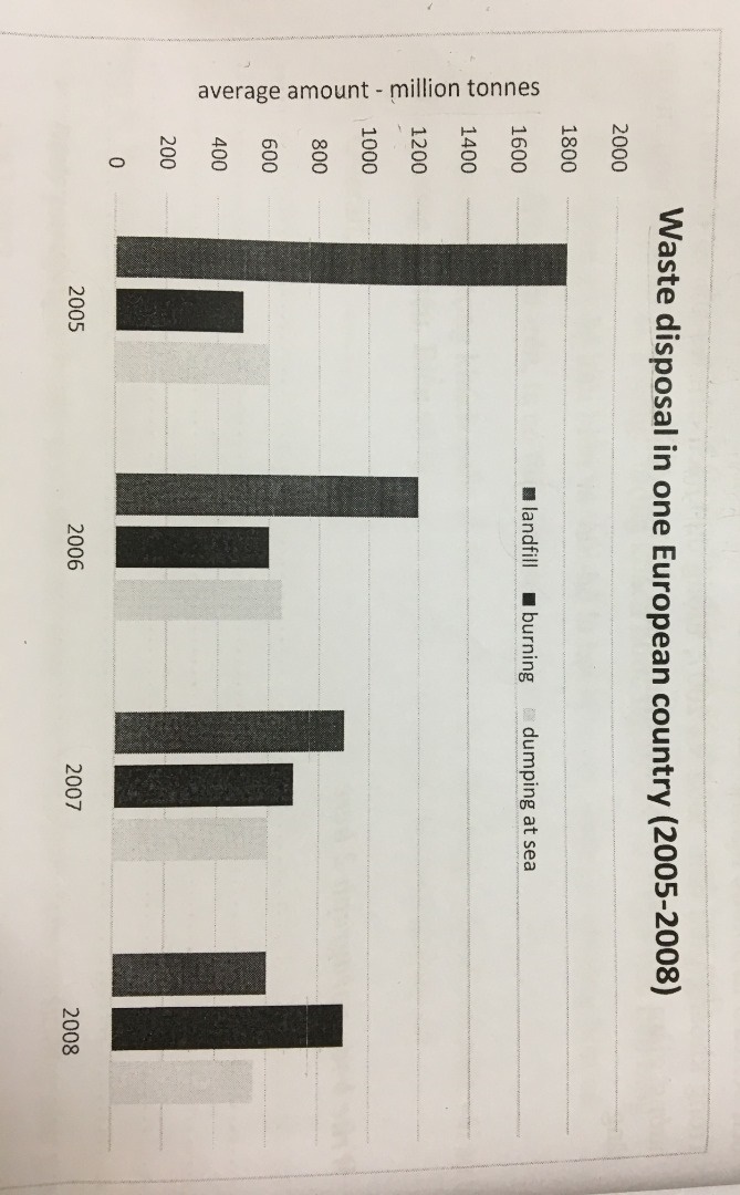
The diagram illustrates the average amount of waste being disposed of by three ways in a country from Europe over a period of four years from 2005 to 2008.
Overall, landfill sites were most used for waste disposal almost all the time surveyed although the trend was downward. In addition, it is obvious that the amount of waste being burnt increased during the period.
In 2005, 1800 million tonnes of waste was disposed at landfill sites. This figure was approximately three times as high as the amount burnt and dumped at sea, with around 500 million tonnes and 600 million tonnes respectively. Over the next two years, the average amount of waste buried reduced significantly, reaching about 900 million tonnes in 2007. While these figures for waste disposed to sea remained at the level of 600 million tonnes, the amount of waste incinerated rose gradually, reaching 700 million tonnes in 2007.
In 2008, after decreasing by over 200 million tonnes, waste dumped into landfill sites reached 600 million tonnes. This trend was the same with garbage dumped at sea, dropping to below 600 million tonnes at the end of the period. By contrast, burning was an increasingly favorable method of disposal, with 900 million tonnes of garbage removed in this way in 2008.
Top answer
The diagram (wrong word. ) illustrates (wrong word. ) the average amount of waste being disposed of by three ways in a country from Europe over a period of four years from 2005 to 2008 .
- The diagram (wrong word.
- ) illustrates (wrong word.
- ) the average amount of waste being disposed of by three ways in a country from Europe over a period of four years from 2005 to 2008 .
- (That is appropriate for a continuous line graph, but that is not what the figure is.
- ) (Incomplete.
Get the Weekly English Kit 📬
New words, one handy idiom, and a 2-minute quiz — delivered to your inbox to keep your streak alive.
The diagram (wrong word. This is not a diagram.) illustrates (wrong word. This is not a map or a picture.) the average amount of waste being disposed of by three ways in a country from Europe over a period of four years from 2005 to 2008. (That is appropriate for a conti
 Related Questions