
Please help me with this writing task 1 essay-Line graph
Dear teacher,
Please help me with this writing task 1 essay-Line graph.
Thanks
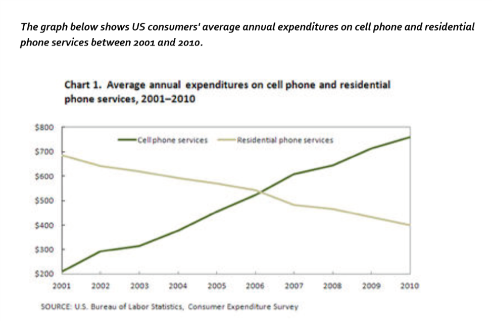
The line graph illustrate the changes in US consumer’s average twelve-monthly spending on mobile phone and residential phone services in a period of 10 years.
Overall, in 10 year from 2001 to 2010 both cell phone and residential phone services had significant fluctuation. There was an upward trend for portable phone whereas the opposite is true for residential phone.
At the begin, in 2001, cell phone services started from the lowest point, about $200 ; however, the number of expenses that US consumer had spent on mobile phone increased stably gradually between 2001 and 2010 and the figure in 2010 had reached the highest point nearly $800.
On the other hand, the graph show that in the past, people in US preferred to use residential phone than cell phone, at $690. In contrast, the number of expenditures decreased continually. In 2006, both of the line were intersected at $550 and after that data of residential phone services still been on the way gone down until 2010.
Top answer
The line graph illustrate (wrong form) the changes in US consumer’s average twelve-monthly (not a good phrase) spending on mobile phone and residential phone services in a period of 10 years . (Which 10 years? 1860-1870?
- The line graph illustrate (wrong form) the changes in US consumer’s average twelve-monthly (not a good phrase) spending on mobile phone and residential phone services in a period of 10 years .
- (Which 10 years?
- 1860-1870?
- ) Overall, in 10 year from 2001 to 2010 , spending on both cell phone and residential phone services had significant fluctuation.
- (Incorrect.
Get the Weekly English Kit 📬
New words, one handy idiom, and a 2-minute quiz — delivered to your inbox to keep your streak alive.
The line graph illustrate (wrong form) the changes in US consumer’s average twelve-monthly (not a good phrase) spending on mobile phone and residential phone services in a period of 10 years.
 Related Questions