
Please help me with this essay. Tourism in Brighton, England
Question: The line graph below shows the percentage of tourists to England who visited four different attractions in Brighton. Summarise the information by selecting and reporting the main features, and make comparisons where relevant.
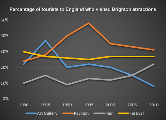
The line graph illustrates the proportion of visitors to the art gallery, the pavilion, the pier and the festival of Brighton in England from 1980 to 2010.
Overall, while the pier attracted more tourists over the period shown, the art gallery became less popular with the number of visitors decreasing in the early 2000s.
In 1980, the percentage of people who visited the art gallery in Brighton was approximately 21%, which was slightly lower than that of the pavilion, at roughly 23%. The proportions of visitors to Brighton’s art Gallery and pavilion grew dramatically, peaking at about 38% in 1985 and 48% in 1995 respectively. By 2010, although there was a decline in the percentage of tourists traveling to these two places, data for the art gallery experienced a more rapid and considerable decrease than that of the pavilion.
Regarding the proportion of the festival and the pier, whereas the percentage of the former fluctuated continually between 1980 and 2000, but almost doubled in the last three years, the latter remained stable, staying just under 30% over the 1980-2010 period.
Top answer
The line graph illustrates the proportion of tourists who came to England who visited visitor s to the A rt G allery, the P avilion, the P ier and the F estival in Brighton in England from 1980 to 2010. (The attractions have names. ) Overall, while the p ier attracted more tourists over the period shown, the a rt g allery became less popular with the number percentage of visitors decreasing in the early 2000s.
- The line graph illustrates the proportion of tourists who came to England who visited visitor s to the A rt G allery, the P avilion, the P ier and the F estival in Brighton in England from 1980 to 2010.
- (The attractions have names.
- ) Overall, while the p ier attracted more tourists over the period shown, the a rt g allery became less popular with the number percentage of visitors decreasing in the early 2000s.
- In 1980, the percentage of people who visited the a rt g allery in Brighton was approximately 21%, which was slightly lower than that of the p avilion, at roughly 23%.
- The proportions of visitors to Brighton’s ar t Gallery and p avilion grew dramatically, peaking at about 38% in 1985 and 48% in 1995 respectively.
Get the Weekly English Kit 📬
New words, one handy idiom, and a 2-minute quiz — delivered to your inbox to keep your streak alive.
The line graph illustrates the proportion of tourists who came to England who visited visitors to the Art Gallery, the Pavilion, the Pier and the
 Related Questions