
Please help me with my writing task 1.
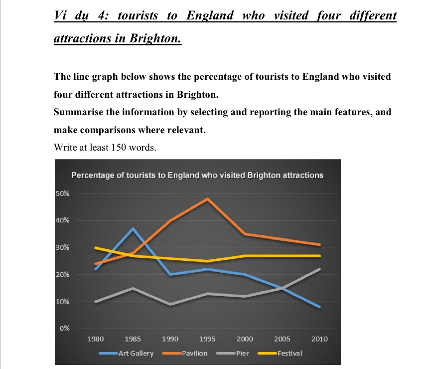
The line graph compares the percentage of travellers to England who visited Art Gallery, Pavilion, Pier and Festival in Brighton from 1980 to 2010. The units of measure are percentage.
Generally, Pavilion was by far the most visited attractions over the period shown. The percentage of tourists visited Festival remained probably stable during the same period. Pier was travelled by the lowest number of travellers, but rapidly overtook Art Gallerry between 2005 and 2010.
From 1980 to 1985, the percentage of visitors who visited Art Gallery rapidly reached a peak at around 38 percent. Pavilion and Pier, in turn, were visited by 28 percent and 15 percent of tourists to England who visited Brighton attractions. By contrast, the percentage of tourists who visited Festival dropped from 30 percent to 28 percent over a period of 5 years.
By 1995, the percentage of visitors who visited Pavilion significantly hit a high of 48 percent, which has doubled since 1980. There were no changes in the percentage of tourists visitting Art Gallery as well as Pier this year. Whereas, the percentage of travellers who travelled Frestival declined from 30 percent to 28 percent.
Top answer
The line graph compares the percentage of travellers to England who visited Art Gallery, Pavilion, Pier and Festival in Brighton from 1980 to 2010. The units of measure are percentage . (When you say "percentage of travellers", you have already told the reader the units.
- The line graph compares the percentage of travellers to England who visited Art Gallery, Pavilion, Pier and Festival in Brighton from 1980 to 2010.
- The units of measure are percentage .
- (When you say "percentage of travellers", you have already told the reader the units.
- ) Generally, Pavilion was by far the most visited attractions (wrong form) over the period (That is not true.
- ) shown.
Get the Weekly English Kit 📬
New words, one handy idiom, and a 2-minute quiz — delivered to your inbox to keep your streak alive.
The line graph compares the percentage of travellers to England who visited Art Gallery, Pavilion, Pier and Festival in Brighton from 1980 to 2010. The units of measure are percentage. (When you say "percentage of travellers", you have already told the reader the units. Do not repeat this.)
Generally, Pavilion was by far the most visited
 Related Questions