
Please help me with my ilets writing task 1
The chart below shows the percentage of difference in income between men and women
from 1978 to 2008
Summarise the information by selecting and reporting the main features, and make
comparisons where relevant
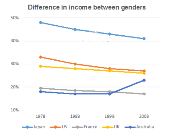
The chart dedicates the proportion of inconsistency in income between male and female of five different countries from 1978 to 2008. Overall, the trends in Japan, US, France and UK decreased gradually, while there is an increment in Australia during the period of 30 years.
It is obvious that in 1978, the difference in income in Japan started at its highest point, nearly 50%. The figures for US, UK, France were lower, at about 33%, nearly 30% and nearly 20% respectively. In the 1978-2008 period, all these countries saw a moderate decline in the discrepancy of income among genders.
In Australia, from 1978 to 1998, the trend was also in terms of general fall along with others above. However, in the decade of 1998-2008, the Australian proportion went up and peaked at approximately 24%.
Top answer
The chart dedicates (wrong word) the proportion (wrong word) of inconsistency (wrong word) in income between male (wrong form) and female (wrong form) of (wrong word) five different countries from 1978 to 2008. Overall, the trends (wrong word) in Japan, US, France and UK decreased gradually, while there is an increment (wrong word) in Australia during the period of 30 years. You have chosen many incorrect vocabulary words.
- The chart dedicates (wrong word) the proportion (wrong word) of inconsistency (wrong word) in income between male (wrong form) and female (wrong form) of (wrong word) five different countries from 1978 to 2008.
- Overall, the trends (wrong word) in Japan, US, France and UK decreased gradually, while there is an increment (wrong word) in Australia during the period of 30 years.
- You have chosen many incorrect vocabulary words.
- For Task 1, do not use synonyms (especially if you pick them out of a dictionary) because Task 1 is about mathematical precision, not about eloquence of expression.
- Mathematical terms are very exact.
Get the Weekly English Kit 📬
New words, one handy idiom, and a 2-minute quiz — delivered to your inbox to keep your streak alive.
The chart dedicates (wrong word) the proportion (wrong word) of inconsistency (wrong word) in income between male (wrong form) and female
 Related Questions