
Please help me with my essay . Ielts Writing task 1 . Thank you so much !
The charts below show the changes in ownership of electrical appliances and amount of time spent doing housework in households in one country between 1920 and 2019.
Summarise the information by selecting and reporting the main features, and make comparisons where relevant.
The line charts compare the percentages of families using electricity and the number of hours spent doing housework from 1920 to 2019.
Overall, there was an upward trend in the proportion of domestic with electrical appliances, but the opposite was true for the decrease in the amount of time with housework over the period.
In the first chart, the most significant change was seen in the percentage of using the refrigerator, from 0% in 1920 to 90% in 1960 and reached a peak of 100% in 1980, remained stable until 2019. Similarly, the proportion of utilizing vacuum cleaners witnessed an upward tendency, with an increase of exactly 70% over the year. The low figures were seen in the percentage of using washing machines, which surged gradually from 40% in 1920 to approximately 75% in 2019.
It can be seen in the second chart that the number of hours in household chores declined steeply by 30% in the first 40 years and continued to go down slowly from 20% in 1960 to roughly 10% in 2019. 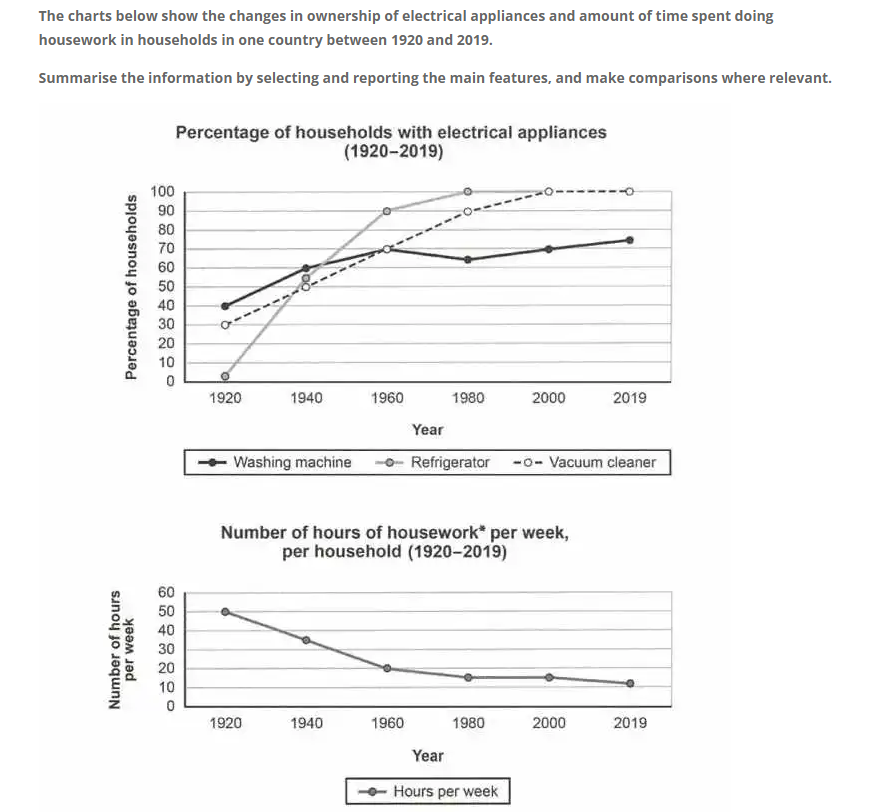
Top answer
Please post essays, paragraphs, dialogues and other writing in the essay forum so a moderator does not have to move your post. Click on this link: Next, tap on the green button "write a new post" Also, clearly separate your answer from the instructions. Please read my advice for Task 1 essays: IELTS TASK 1: Hints, Tips And Advice Vocabulary Words For Task 1: Reference Post
- Please post essays, paragraphs, dialogues and other writing in the essay forum so a moderator does not have to move your post.
- Click on this link: Next, tap on the green button "write a new post" Also, clearly separate your answer from the instructions.
- Please read my advice for Task 1 essays: IELTS TASK 1: Hints, Tips And Advice Vocabulary Words For Task 1: Reference Post
Get the Weekly English Kit 📬
New words, one handy idiom, and a 2-minute quiz — delivered to your inbox to keep your streak alive.
The line charts (Wrong words. There are pie charts, bar charts, eye charts, organization charts, flow charts and Gantt charts. There is no such thing as a line chart. ) compare the percentages of families using electricity (That is not correct. That is not what is plotted on the graph. There
 Related Questions